Home Blog Page 74

Flutter Interactive Viewer widget – Flutter V 1.20

0
Flutter Interactive Viewer example

Hi Guys, Welcome to Proto Coders Point, In this flutter tutorial we will build an application to demonstrate new feature of Flutter 1.20 that is Flutter Interactive Wiewer Widget.

What is Interactive Viewer Flutter?

Recently on August 4th 2020 Flutter team have launched V1.20, that comes with awesome developement tools.

one of it is Flutter Interactive Viewer

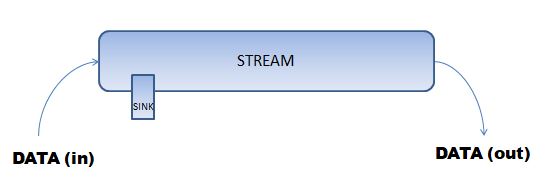
This Interactive Viewer is designed for developing simple & commonly interaction that happens into your application, such as Pan, Zooming or drag n drop events and using this widget user can easily resize the widget child.

Basically Interactive Viewer class is a widget that let’s us with the feature of  pan(Drag),Zooming with 2 finger touch.

flutter 1.20 dart 2.9.0

Implementation of interactive viewer in android-studio(IDE)

So Let’s Implement it in our flutter project

Step 1: Create a new flutter project

I am using Android-Studio as my IDE to build Flutter Apps, you my make use of Android-studio or VSCode editor.

File > New > New Flutter Project

Give a name to the project as per your choose and continue.

Explanation of Flutter Interactive Viewer (Snippet Code)

Here is the basic explanation of each properties used in below snippet code.

InteractiveViewer(
                    boundaryMargin: EdgeInsets.all(20.0),
                    transformationController: transformationController,
                    
                    minScale: 0.1,
                    maxScale: 1.6,

                    // You can off zooming by setting scaleEnable to false
                    //scaleEnabled: false,
                    onInteractionStart: (_)=>print("Interaction Started"),
                    onInteractionEnd: (details) {
                      setState(() {
                        transformationController.toScene(Offset.zero);
                      });
                    },
                    onInteractionUpdate: (_)=>print("Interaction Updated"),
                    child: ClipRRect(borderRadius: BorderRadius.circular(15),child: Image.network("https://pbs.twimg.com/profile_images/1243950916362895361/Z__-CJxz_400x400.jpg")),
                  )

boundrymargin: it is just to define the space or margin from all the sides of the interactive viewer child.

minScale: here minimun scale means how much a uses can zoom out the widget, here 0.1  for example means 10% scale of the widget.

maxScale: Basically the maximum size that the widget can be Zoomed in by the user.

onInteractionStart: what event should occur when user try to interact with the widget either when user try to zoom or when user try to drag the widget.

OnInteractionUpdate: what event/function should occur when user drag or zoom the widget to new view/position.

OnInteractionEnd: when user drag and drop or when user simple interaction with widget leave free the widget, what event should happens

for example: when user zoom the image and then leave it, onInteractionEnd will get triggered and event like image get auto resized back to its original position.

In above Snippet code, in child tag we have a image widget that will simply load image from internet using IMAGE URL.

Step 2: Complete code of Flutter Interactive Viewer

Then in main.dart file under lib directory of you flutter project just copy below full code and run the project.

main.dart

import 'package:flutter/cupertino.dart';
import 'package:flutter/material.dart';

void main() {
  runApp(MyApp());
}

class MyApp extends StatelessWidget {
  // This widget is the root of your application.
  @override
  Widget build(BuildContext context) {
    return MaterialApp(
      title: 'Flutter Demo',
      theme: ThemeData(
        primarySwatch: Colors.blue,
        visualDensity: VisualDensity.adaptivePlatformDensity,
      ),
      home: MyHomePage(),
      debugShowCheckedModeBanner: false,
    );
  }
}

class MyHomePage extends StatefulWidget {
  @override
  _MyHomePageState createState() => _MyHomePageState();
}

class _MyHomePageState extends State<MyHomePage> {
  final transformationController = TransformationController();
  @override
  Widget build(BuildContext context) {
    return Scaffold(
      appBar: AppBar(title: Text("Interactive Viewer"),),
      backgroundColor: Colors.black38,
      body: Center(
        child: Container(
          width: MediaQuery.of(context).size.width-50,
          height: MediaQuery.of(context).size.height-250,
          child: Card(
            child: Column(
              mainAxisAlignment: MainAxisAlignment.start,
              children: [
                Padding(
                  padding: const EdgeInsets.all(8.0),
                  child: ListTile(
                    leading: ClipRRect(borderRadius: BorderRadius.circular(50.0),child: Image.network("https://protocoderspoint.com/wp-content/uploads/2019/10/mypic-300x300.jpg")),
                    title: Text(" Rajat Palankar",style: TextStyle(fontSize: 15,fontWeight: FontWeight.bold),),
                    subtitle: Row(
                      children: [
                        Text("Just Now",style: TextStyle(fontSize: 12),),
                        SizedBox(width: 10,),
                        Icon(Icons.public,size: 15,color: Colors.grey,)
                      ],
                    ),
                    trailing: Icon(Icons.more_horiz),
                  )
                ),

                Padding(
                  padding: const EdgeInsets.all(8.0),
                  child: InteractiveViewer(
                    transformationController: transformationController,
                    boundaryMargin: EdgeInsets.all(20.0),
                    minScale: 0.1,
                    maxScale: 1.6,

                    // You can off zooming by setting scaleEnable to false
                    //scaleEnabled: false,
                    onInteractionStart: (_)=>print("Interaction Started"),
                    onInteractionEnd: (details) {
                      setState(() {
                        transformationController.toScene(Offset.zero);
                      });
                    },
                    onInteractionUpdate: (_)=>print("Interaction Updated"),
                    child: ClipRRect(borderRadius: BorderRadius.circular(15),child: Image.network("https://pbs.twimg.com/profile_images/1243950916362895361/Z__-CJxz_400x400.jpg")),
                  ),
                ),
                Padding(
                  padding: const EdgeInsets.all(8.0),
                  child: ListTile(
                    leading: Column(children: [Icon(Icons.thumb_up,color: Colors.blue,),Text("110K",style: TextStyle(fontSize: 12),)],),
                    title: Column(children: [Icon(Icons.message,color: Colors.green,),Text("1201",style: TextStyle(fontSize: 12))],),
                    trailing: Column(children: [Icon(Icons.share,color: Colors.blue,),Text("500",style: TextStyle(fontSize: 12))],),
                  ),
                )
              ],
            ),
          ),
        ),
      )
    );
  }
}


Recommended Articles learn more

Integration of Google Maps in Flutter

Flutter Photo View widget with zoomable image gallery

Flutter provider login example – Firebase login registration using Provider

Development made easy with GetX Plugin

How to show custom toast in android example – toast message android

0

Hi Guys, Welcome to Proto Coders Point, In this android tutorial we will create our own custom toast message in android studio.

What is Toast Message?

Some TImes Toast Messages are also called as Toast Notification.

It’s a small message that pop up at the bottom of the device screen and immediately disappears on it’s own after a delay of few seconds.

This are mostly used to show a feedback on the operation that is preformed by the user.

So, Let’s Begin Implementing of Custom Toast Message into our android project.

Step 1: Create a new project in android studio

File > New > New Project

Give a name to your project as “android custom toast” and hit the next,next finish so that android studio can build a project for you.

Step 2: Create 2 vector image in Drawable folder

As we gonna show 2 toast message i.e Smiling face icon when success toast message and a Error icon when unsuccessful message. So that we need to create 2 vector image in drawable folder

Right Click ( drawable folder ) > New > Vector Image ( select vector image and color and save it )

how to create vector image in android studio

Step 3: Create a layout design for custom toast message

create a new layout file under res > layout and name it as custom_toast_design.xml and paste the below xml design code.

custom toast message android layout design code


custom_toast_design.xml

<?xml version="1.0" encoding="utf-8"?>
<LinearLayout xmlns:android="http://schemas.android.com/apk/res/android"
    android:orientation="horizontal" android:layout_width="match_parent"
    android:layout_height="wrap_content"
    android:background="@android:drawable/dialog_holo_light_frame">

    <LinearLayout
        android:id="@+id/linearColor"
        android:layout_width="70dp"
        android:layout_height="70dp"
        android:layout_gravity="center"
        android:gravity="center"
        android:background="#00cc00">

        <ImageView
            android:id="@+id/imageview"
            android:layout_width="50dp"
            android:layout_height="50dp"
            android:layout_margin="15dp"
            android:background="@drawable/success"/>

    </LinearLayout>

    <LinearLayout
        android:layout_width="match_parent"
        android:layout_height="match_parent"
        android:background="@android:color/white">
        <TextView
            android:id="@+id/toast_message"
            android:layout_width="wrap_content"
            android:layout_height="match_parent"
            android:text="Toast message Here"
            android:layout_margin="10dp"
            android:textSize="15sp"
            android:textColor="@android:color/black"
            android:layout_gravity="center"
            android:gravity="center"
            android:textStyle="bold"/>
    </LinearLayout>


</LinearLayout>

Step 4: activitymain.xml ui code

In activitymain.xml we simple have 2 button that perform some events on click

1 button will display success toast message and 2nd button will displpay error toast message.

activitymain.xml

<?xml version="1.0" encoding="utf-8"?>
<LinearLayout xmlns:android="http://schemas.android.com/apk/res/android"
    xmlns:app="http://schemas.android.com/apk/res-auto"
    xmlns:tools="http://schemas.android.com/tools"
    android:layout_width="match_parent"
    android:layout_height="match_parent"
    android:orientation="vertical"
    android:layout_gravity="center"
    android:gravity="center"
    tools:context=".MainActivity">

    <TextView
            android:layout_width="wrap_content"
            android:layout_height="wrap_content"
            android:textSize="20sp"
            android:textColor="@android:color/holo_blue_dark"
            android:text="Custom Toast message" />

    <Button
           android:layout_width="wrap_content"
           android:layout_height="wrap_content"
           android:text="Show Success Toast"
            android:id="@+id/B_Success"/>

    <Button
            android:layout_width="wrap_content"
          android:layout_height="wrap_content"
         android:text="Show Error Toast"
         android:id="@+id/B_Error"/>


</LinearLayout>

Step 5: Show the custom Toast message in MainActivity

MainActivity.java

package com.example.custom_toast;

import androidx.appcompat.app.AppCompatActivity;

import android.graphics.Color;
import android.os.Bundle;
import android.view.LayoutInflater;
import android.view.View;
import android.widget.Button;
import android.widget.ImageView;
import android.widget.LinearLayout;
import android.widget.TextView;
import android.widget.Toast;

public class MainActivity extends AppCompatActivity {
    Button success_toast,error_toast;

    @Override
    protected void onCreate(Bundle savedInstanceState) {
        super.onCreate(savedInstanceState);
        setContentView(R.layout.activity_main);

        success_toast=(Button)findViewById(R.id.B_Success);
        error_toast=(Button)findViewById(R.id.B_Error);

        success_toast.setOnClickListener(new View.OnClickListener() {
            @Override
            public void onClick(View v) {
                //on success
                //here i m manually passing string and icon to the function
                showCustomToast("Success, Stored Successfully","#00cc00",R.drawable.success);
            }
        });

        error_toast.setOnClickListener(new View.OnClickListener() {
            @Override
            public void onClick(View v) {
                //on success
                //here i m manually passing string and icon to the function
                    showCustomToast("Error, Something went wrong","#ffff00",R.drawable.error);
            }
        });
    }

    //once function that show 2 different kind of toast message
    public void showCustomToast(String text,String color,int icon){
        View toast = LayoutInflater.from(this).inflate(R.layout.custom_toast_deisgn,null);
        Toast custom = new Toast(this);

        custom.setView(toast);

        TextView message = toast.findViewById(R.id.toast_message);
        //setting the color to linear layout
        LinearLayout linearLayoutcolor = toast.findViewById(R.id.linearColor);
        ImageView imageview = toast.findViewById(R.id.imageview);

        //setting the image icon
        imageview.setBackground(this.getResources().getDrawable(icon));

        linearLayoutcolor.setBackgroundColor(Color.parseColor(color));
        
        message.setText(text);
        custom.setDuration(Toast.LENGTH_SHORT);
        custom.show();
    }
}


Conclusion

This tutorial was on building your own custom toast message in android studio.


Related Post

Flutter toast

Flutter Bot Toast Library


flutter bottom navigation bar example 4 pages – Convex Bottom Bar Library

1
convex flutter bottom navigation bar

Hi Guys, Welcome to Proto Coders Point, In this Flutter tutorial we gonna add Bottom navigation bar to our flutter application, So to achieve this we will make use of Flutter Convex Bottom bar library.

Official Convex Bottom bar library page https://pub.dev/packages/convex_bottom_bar Learn more about it.

VIDEO TUTORIAL OF FLUTTER BOTTOM NAVIGATION BAR

if you don’t know how Convex Bottom navigation bar  look like in Flutter, Check out below screenshot of the application output.

flutter convex navigation bar example

Instead, you’re switching out a over all group of content within a single page to give the appearance that the page is changing.Here is a illustration to visually describe what we’re doing. Not that the overall “scaffolding”, as Flutter calls it, stays the same and the contents within the page change.

flutter-bottom-navigation-bar canvex example
Bottom navigation bar with 3 different page switch

Ok so now let’s begin developing flutter application with Convex Bottom bar library

Flutter Bottom Navigation Bar Example

Step 1: Create a new Flutter Project

offcourse you need to create a new Flutter Project, In this tutorial i m making use of Android Studio as my IDE to develop Flutter Projects.

File > New > New Flutter Project

Give a suitable name to your Flutter project and and hit next next finish.

Once the Flutter Project is ready, Flutter project will be built with some default code, just remove all those default code and copy paste below code for a quick start.

import 'package:flutter/material.dart';


void main() {
  runApp(MyApp());
}

class MyApp extends StatelessWidget {
  // This widget is the root of your application.
  @override
  Widget build(BuildContext context) {
    return MaterialApp(
      title: 'Flutter Demo',
      theme: ThemeData(

        primarySwatch: Colors.blue,

        visualDensity: VisualDensity.adaptivePlatformDensity,
      ),
      home: MyHomePage(title: 'Flutter Convex Bottom Bar'),
    );
  }
}

class HomeMainPage extends StatefulWidget {
  @override
  _HomeMainPageState createState() => _HomeMainPageState();
}

class _HomeMainPageState extends State<HomeMainPage> {
  @override
  Widget build(BuildContext context) {
    return Container(
      child: Text("This is Main Page "),
    );
  }
}

Step 2: Add the required dependencies library

As i said at the beginning, i am going to make use of external library to add Bottom material navigation bar in our flutter project.

to add the dependencies, navigate/open pubspec.yaml file and add the following dependencies

dependencies:
  flutter:
    sdk: flutter
  convex_bottom_bar:  #add this line

after adding, just hit that pub get text on top at appears when any change is been done in pubspec.yaml file.

what this will do is, it will fetch all the required library and store into your flutter project as external library.

Step 3: Import the Convex library when required

As you have added the Bottom bar convex library dependencies now you can easily make use of that library just be importing it wherever required.

import 'package:convex_bottom_bar/convex_bottom_bar.dart';

Step 4: How to use Convex bottom navigation bar  (Snippet code)

bottomNavigationBar: ConvexAppBar(

          items: [
            TabItem(icon: Icons.home, title: 'Home'),
            TabItem(icon: Icons.favorite, title: 'Favorites'),
            TabItem(icon: Icons.search, title: 'Search'),
            TabItem(icon: Icons.person, title: 'Profile'),
          ],
          initialActiveIndex: 0,//optional, default as 0
          onTap: (int i ){
           //will print index value of which item is been clicked 

            print("index $i");
          },
        ),

brief description of above Convex App Bar snippet code

as you can see i have added 4 items with some Icons and title to each items.

initialActiveIndex: its is the tab that you want to make active page when the app is been opened for first time.

onTap: will trigger which TabItem index is been pressed, By making use of this index value we can change the page.

Step 5: Create 4 pages

As we are building the app with bottom navigation bar, we required 4 more page that will be displayed in main.dart page body tag.

now create 4 dart file in lib directory of  your flutter project.

Right Click on lib directory > New >Dart File

Home.dart

import 'package:flutter/cupertino.dart';
import 'package:flutter/material.dart';

class Home extends StatelessWidget {
  @override
  Widget build(BuildContext context) {
    return Scaffold(
      body: Column(
        mainAxisAlignment: MainAxisAlignment.center,
        children: <Widget>[
          Center(child: Text("Home Page",style: TextStyle(fontSize: 20),))
        ],
      ),
    );
  }
}

Favorites.dart

import 'package:flutter/cupertino.dart';
import 'package:flutter/material.dart';

class Fav extends StatelessWidget {
  @override
  Widget build(BuildContext context) {
    return Scaffold(
      body: Column(
        mainAxisAlignment: MainAxisAlignment.center,
        children: <Widget>[
          Center(child: Text("Favorites Page",style: TextStyle(fontSize: 20),))
        ],
      ),
    );
  }
}

Search.dart

import 'package:flutter/cupertino.dart';
import 'package:flutter/material.dart';

class Search extends StatelessWidget {
  @override
  Widget build(BuildContext context) {
    return Scaffold(
      body: Column(
        mainAxisAlignment: MainAxisAlignment.center,
        children: <Widget>[
          Center(child: Text("Search Page",style: TextStyle(fontSize: 20),))
        ],
      ),
    );
  }
}

Profile.dart

import 'package:flutter/cupertino.dart';
import 'package:flutter/material.dart';

class Profile extends StatelessWidget {
  @override
  Widget build(BuildContext context) {
    return Scaffold(
      body: Column(
        mainAxisAlignment: MainAxisAlignment.center,
        children: <Widget>[
          Center(child: Text("Profile Page",style: TextStyle(fontSize: 20),))
        ],
      ),
    );
  }
}

then now, we have created 4 page, that will be displayed when items from bottom navigation bar is been clicked.

Step 6: Final Complete Flutter Code to Display Bottom Navigation bar with pages

Explanation of what going on the below code

i have declared 2 variable

selectedPage is of type integer value with default value as 0

and pageOptions with 4 pages stored in a form arrays.

int selectedPage = 0;
  final _pageOptions = [Home(),  Fav(),Search(), Profile()];

here intial selected page index is 0 so Home() page will be shown when the app get launched first.

body: _pageOptions[selectedPage],

and in bottomNavigationBar tab: we have

bottomNavigationBar: ConvexAppBar(

  items: [
    TabItem(icon: Icons.home, title: 'Home'),
    TabItem(icon: Icons.favorite, title: 'Favorites'),
    TabItem(icon: Icons.search, title: 'Search'),
    TabItem(icon: Icons.person, title: 'Profile'),
  ],
  initialActiveIndex: selectedPage,//optional, default as 0
  onTap: (int index ){
    setState(() {
      selectedPage = index;
    });
  },
),

Here we have 4 tabs in Bottom bar Home, Favorites, Search, Profile, and initialActiveIndex is set to 0 that is selectedPage, and when any Tab is been Pressed onTap will get Triggred with the index value Tab that been selected and selectedPage will get changed with the index value , and hence selected Index page will be get displayed in body tag of main.dart page.

Complete  flutter code

import 'package:convex_bottom_bar/convex_bottom_bar.dart';
import 'package:flutter/material.dart';
import 'Home.dart';
import 'Fav.dart';
import 'Search.dart';
import 'Profile.dart';

void main() {
  runApp(MyApp());
}

class MyApp extends StatelessWidget {
  // This widget is the root of your application.
  @override
  Widget build(BuildContext context) {
    return MaterialApp(
      title: 'Flutter Demo',
      theme: ThemeData(

        primarySwatch: Colors.blue,

        visualDensity: VisualDensity.adaptivePlatformDensity,
      ),
      home: MyHomePage(title: 'Flutter Convex Bottom Bar'),
    );
  }
}

class MyHomePage extends StatefulWidget {
  MyHomePage({Key key, this.title}) : super(key: key);

  final String title;

  @override
  _MyHomePageState createState() => _MyHomePageState();
}

class _MyHomePageState extends State<MyHomePage> {

  int selectedPage = 0;
  final _pageOptions = [Home(),  Fav(),Search(), Profile()];


  @override
  Widget build(BuildContext context) {

    return Scaffold(
      appBar: AppBar(

        title: Text(widget.title),
      ),
      body: _pageOptions[selectedPage],
        bottomNavigationBar: ConvexAppBar(

          items: [
            TabItem(icon: Icons.home, title: 'Home'),
            TabItem(icon: Icons.favorite, title: 'Favorites'),
            TabItem(icon: Icons.search, title: 'Search'),
            TabItem(icon: Icons.person, title: 'Profile'),
          ],
          initialActiveIndex: 0,//optional, default as 0
          onTap: (int i ){
            setState(() {
              selectedPage = i;
            });
          },
        ),// This trailing comma makes auto-formatting nicer for build methods.
    );
  }
}

Conclusion

In this above Flutter tutorial we have learnt how to add Botton Navigation bar in our flutter project

Related Flutter tutorial articles

bottom navigation bar flutter

Flutter Bottom Navigation Bar with Fancy Animation effect

Flutter UI/UX Animated Curved Navigation Bar Library

Flutter BLoC Pattern Tutorial – Inc & Dec Example

1
Flutter BLoC Pattern Tutorial - Inc & Dec Example

Hi Guys, Welcome to Proto Coders Point, In this Flutter Tutorial we gonna Learn basic of Flutter BLoC Pattern, Basically we will build a simple app that can perform Increment & Decrement operations.

FINAL RESULT

Bloc pattern inc and dec app

What is a Bloc?

A BLoC we can simply understand with the help of below Diagram.

simple way to understand Flutter bloc pattern with example

Business logic Component is basically a Box where Events cames from one side & the State comes out with the required data from other side.

Check out the tutorial atricle on Introduction of Flutter Bloc pattern

https://protocoderspoint.com/introduction-to-flutter-bloc-pattern-tutorial/ 

Flutter is really an awesome framework because it allows fully freedom to the app developer in how to manage the state, If i say BLoC (Business Logic Component) pattern is the prefect tool that fits for Flutter application and that is the reason i am here with Flutter BLoC pattern tutorial.

Flutter BLoC Pattern Tutorial – Inc & Dec Example

So Basically  in our Flutter Bloc pattern example, there are 2 kinds of events that will be performed by the used i.e 1. Increment Event 2. Decrement Event.

Video Tutorial on Flutter BLoC Pattern


Step 1: Create a dart file (Event_Counter)

Now, Create a dart file inside lib folder of your flutter project & name it as

This File will handle event.

Event_Counter.dart

abstract class EventCounter{}

//abstract class to find out which Event was occurred

class IncrementEvent extends EventCounter{}

class DecrementEvent extends EventCounter{}

Step 2: Create a Flutter BLoC Class

then, Now Create a Flutter BLoC Class dart file under lib directory and name it as BlocCounter.dart

import 'dart:async';
import 'EventCounter.dart';

// async enable

class Bloc_Counter{
  int _counter = 0;

  //StreamCountroller handle input and output
  final _counterStateController = StreamController<int>();

  // Sink in Flutter can be easily stated, In Simple Words Sink = Import
  StreamSink<int> get _inCounter =>_counterStateController.sink;

  // Stream in Flutter can be easily stated, In Simple Words Stream = Output
  Stream<int> get counter =>_counterStateController.stream;

  //event controller to trigger which event has occurred
  final _counterEventController = StreamController<EventCounter>();

  Sink<EventCounter> get counterEventSink =>_counterEventController.sink;

  Bloc_Counter(){
    _counterEventController.stream.listen((_mapEventtoState));
  }

  void _mapEventtoState(EventCounter event){
    // depending on event either increment or decrement the counter variable
    if(event is IncrementEvent)
      _counter++;
    else
      _counter--;

    _inCounter.add(_counter);

  }

  // Dispose the Controller, Very important step, Otherwise you may get memory leak
  void dispose(){
    _counterStateController.close();
    _counterEventController.close();
  }
}

Brief information of what is going on the above Flutter Bloc pattern code.

async allows us to use Flutter Feature like StreamController, Stream, Future and Sink.

Sink in Flutter can be easily stated, In Simple Words Sink = Import.

Stream in Flutter can be easily stated, In Simple Words Stream = Output.

Event controller to trigger which event has occurred

and every Controller must be disposed when application is not in use, otherwise it may lead to memory leak.

Step 3: UI Design

Then, open main.dart file and copy paste below lines of code

import 'package:flutter/cupertino.dart';
import 'package:flutter/material.dart';
import 'package:flutter_bloc_example/Bloc_Counter.dart';
import 'package:flutter_bloc_example/EventCounter.dart';


void main() {
  runApp(MyApp());
}

class MyApp extends StatelessWidget {
  // This widget is the root of your application.
  @override
  Widget build(BuildContext context) {
    return MaterialApp(
      title: 'Flutter Demo',
      debugShowCheckedModeBanner: false,
      theme: ThemeData(
        primaryColor: Colors.blue,

        visualDensity: VisualDensity.adaptivePlatformDensity,
      ),
      home: MyHomePage(),
    );
  }
}

class MyHomePage extends StatefulWidget {
  @override
  _MyHomePageState createState() => _MyHomePageState();
}

class _MyHomePageState extends State<MyHomePage> {
  final _bloc = Bloc_Counter();
  @override
  Widget build(BuildContext context) {
    return Scaffold(
      appBar: AppBar(
        title: Text("Flutter Bloc Example"),
      ),
      body: Center(
        child: StreamBuilder(
          stream: _bloc.counter,
          initialData: 0,
          builder: (BuildContext context,AsyncSnapshot<int> snapshot){
            return Column(
              mainAxisAlignment: MainAxisAlignment.center,
              children: <Widget>[
                Image.network("https://raw.githubusercontent.com/felangel/bloc/master/docs/assets/flutter_bloc_logo_full.png",width: 250,height: 200,),
               Text("Flutter Bloc Example", style: TextStyle(fontStyle: FontStyle.italic,fontSize: 25),),
                Text("Press Below Button "),
                Text(
                  '${snapshot.data}',
                  style: TextStyle(fontSize: 30)
                ),
              ],
            );
          },
        ),
      ),
        floatingActionButton: Row(
          mainAxisAlignment: MainAxisAlignment.end,
          children: <Widget>[
            FloatingActionButton(
              child: Icon(Icons.add),
              backgroundColor: Colors.green,
              onPressed: (){
                print("Increment");
                //class bloc class by passing IncrementEvent
                _bloc.counterEventSink.add(IncrementEvent());
              },
            ),
            SizedBox(
              width: 20,
            ),
            FloatingActionButton(
              child: Icon(Icons.remove),
              backgroundColor: Colors.red,
              onPressed: (){
                print("Decrement");
                //class bloc class by passing DecrementEvent
                _bloc.counterEventSink.add(DecrementEvent());
              },
            )
          ],
        ),
    );
  }

  @override
  void dispose() {
    super.dispose();
    //dispose all the controller
    _bloc.dispose();
  }
}


Thus, your Flutter Application is ready with Flutter Bloc Feature.

Guys, if you have any confusion just check out my Project Structure below.

flutter bloc project structure example

Conclusion

In this article we learnt How to Build and Flutter App, that can perform Increment and Decrement operation by using Flutter Business Logic Component to perform the event and change the Flutter application UI state as per .

Introduction to Flutter BLoC Pattern | Flutter Bloc tutorial with Example

1
Flutter BLoC Pattern tutorial with example

Hi Guys, Welcome to Proto Coders Point, In this Flutter bloc Tutorial we gonna learn about what is BLoC patterns in Flutter, and how to Implement the Flutter Business Logic Component Flutter bloc example.

What is Flutter BLoC?

In order to learn or understand anything about BLoC, you need to have some basic knowledge about these 4 terms in Flutter Development.

  1. State
  2. Event
  3. Stream
  4. Sink.

State: A State in the flutter app is nothing but the data your application is currently been showing. As you guys know that Flutter is a reactive framework as data changed, Application UI also gets change.

Event: An Event is an action that is detected by the application, Typically, it’s a user action like clicking on a button and some action is be performed.

Stream: A Stream can be considered as a medium through which data is transferred. Easily understanding of Stream can be assumed like a pipeline from where the water is been supplied to other ends, How water travel through pipeline like the same way data is transferred through the stream.

flutter bloc stream diagram

There comes a point where we consume or receive data that is been flowing through the stream, This is where we can call Sink

Sink: A Sink can e considered as the point where you receive or consume data from a stream.

So now you know basics of these 4 terms, now you can easily understand what is flutter BLoC.

Flutter Bloc Pattern

3 different component of Flutter BLoC Pattern

  • UI
  • BLoC
  • Data Provider

component of flutter BLoC

Here UI can interact with bloc & bloc can also do the same.

The Bloc provider can interact with the data provider for data.

What is BLoC Stands For?

A BLoC stands for Business Logical Component, A Flutter BLoC contents all the Business logic of a Application.

What is Data Provider in BLoC Pattern?

A Data Provider can be considered as your back-end i.e your database where all the users data is been stared.

How Flutter BLoC Works?

When an application is built using the Flutter BLoc pattern, whenever any data change is found in the data provider, BLoC (Business Logic Component) applies business logic to the current state & it re-creates the new state to the UI & when UI receive the new state it re-render itself to show the latest version of UI with new data that is been received from the data provider.

Let’s Understand Flutter Bloc with an Application Example

Flutter BLoC Pattern Example

Flutter BLoC Pattern Tutorial Example

Step 1: Create a new Flutter project

In my case, I am making use of the android studio as my IDE to develop the Flutter project

Create new Project File > New > New Flutter Project

Give a name to your project as “Flutter Bloc Load image Example” or anything as per your choice.

Step 2: Add Required Dependencies

Then, Open pubspec.yaml file and add below 2 dependencies

dependencies:
  flutter:
    sdk: flutter
  flutter_bloc: ^6.0.1  #this
  bloc: ^6.0.1          #this

after adding this 2 dependencies now click on  pub get text, What this will do is download all the required packages into your flutter project external library.

Step 3: Create a new dart file

Then, once you have added bloc dependencies, now create a new dart file under the lib directory and name it as “BlocImage.dart” 

and then Copy below lines of BlocImage Code that will simply return the URL of an image.

import 'package:bloc/bloc.dart';

enum ImageEvent{getImage}

class BlocImage extends Bloc<ImageEvent,String>
{
  BlocImage(String initialState) : super('https://upload.wikimedia.org/wikipedia/commons/thumb/a/ac/No_image_available.svg/1024px-No_image_available.svg.png');

  @override
  Stream<String> mapEventToState(ImageEvent event)  async*{
    // TODO: implement mapEventToState
    yield 'https://protocoderspoint.com/wp-content/uploads/2019/10/protocoderspoint-rectangle-round-.png';
  }

}

Note: return, returns the values and also terminates the function, where a yield, returns the value but does not terminate the function.

In the above Bloc code I have set initialState to an image URL that has Not to Image Message, and when the user clicks on Button event mapEventToState gets trigged and original image will get displayed on the screen.

Step 4: main.dart file

Copy-paste the below code in main.dart file

import 'package:flutter/cupertino.dart';
import 'package:flutter/material.dart';
import 'package:flutter_bloc/flutter_bloc.dart';
import 'package:flutter_bloc_example/BlocImage.dart';

void main() {
  runApp(MyApp());
}

class MyApp extends StatelessWidget {
  // This widget is the root of your application.
  @override
  Widget build(BuildContext context) {
    return MaterialApp(
      title: 'Flutter Demo',
      debugShowCheckedModeBanner: false,
      theme: ThemeData(
        primarySwatch: Colors.blue,

        visualDensity: VisualDensity.adaptivePlatformDensity,
      ),
      home: Scaffold(
        body: BlocProvider(
          create: (BuildContext context)=> BlocImage("0"),
          child: MyHomePage(),
        ),
      ),
    );
  }
}
class MyHomePage extends StatelessWidget {

  @override
  Widget build(BuildContext context) {

    final _blocimage = BlocProvider.of<BlocImage>(context);
    return Center(
      child: Column(
        mainAxisAlignment: MainAxisAlignment.center,
        children: <Widget>[
          Image.network("https://raw.githubusercontent.com/felangel/bloc/master/docs/assets/flutter_bloc_logo_full.png",width: 250,height: 200,),
          Text("Flutter Bloc Example", style: TextStyle(fontStyle: FontStyle.italic,fontSize: 30),),

          BlocBuilder<BlocImage,String>(
            builder: (BuildContext context,String urlstate){
              return Image.network(urlstate,width: 200,height: 200,);
            },
          ),
          ButtonBar(
            alignment: MainAxisAlignment.center,
            children: <Widget>[
              RaisedButton(
                child: Text("Get  Image"),
                color: Colors.blue[700],
                onPressed: (){
                  _blocimage.add(ImageEvent.getImage);
                },
              ),
            ],
          )
        ],
      ),
    );
  }
}


So In Above lines of code i have wrapped MyHomePage widget class in BloCprovider, what the BLocProvider will do is, it will pass the BlocImage instance to its child MyHomePage.

So to refer BlocImage in your MyHomePage i have created a final variable as you may see in above complete or below snippet code.

final _blocimage = BlocProvider.of<BlocImage>(context);

on Button Click Event new data will be fetched from the Flutter BLoC pattern

RaisedButton( child: Text("Get Image"), color: Colors.blue[700], onPressed: (){ _blocimage.add(ImageEvent.getImage); }, ),

Which widget should get re-rendered on data change can be done as below

BlocBuilder<BlocImage,String>( builder: (BuildContext context,String urlstate){ return Image.network(urlstate,width: 200,height: 200,); }, ),

FINAL FLUTTER BLOC EXAMPLE OUTPUT TO LOAD IMAGE AFTER BUTTON CLICK EVENT

flutter bloc tutorial example gif

Sorry, Here Click is not visible, So when I click on the Get Image button the Image is getting loaded from the URL I have provided.

How to Generate Flutter App icons – Flutter Launcher Icons Change

2
Easy way to change App ICON

Hi Guys, Welcome to Proto Coders Point, In the Flutter tutorial we will generate an app icon for your flutter project Launcher icon.

To do so we gonna make use of a flutter library called Flutter Launcher Icons Generator – A True Icon.

Official Site Link: https://pub.dev/packages/flutter_launcher_icons

Brief about Flutter Launcher Icons

Flutter Launcher icons are been built so that developers can easily use them to update their flutter app icon very easily.

This Library is Fully Flexiable, as it allows us to choose for which platform you want change/update the launcher icon, and if you want to keep backup of old icon you can do it by using this library.

So let’s Begin the Process,

Note: I am using Android Studio for developing the Flutter Application and demonstrate how to generate flutter app icon.

Video Tutorial

Step 1: Create a new Flutter Project

ha ha ha, Offcourse you need a flutter project, In Android-Studio or any of your IDE create a new Flutter Project.

File => New => New Flutter Project

Give a name to your flutter project and continue.

Step 2: Add Launcher Icon Library Dependencies

Then, open pubspec.yaml file ( found in your project ) and add the following dependencies line.

dev_dependencies:
  flutter_test:
    sdk: flutter
  flutter_launcher_icons: "^0.7.3"   #this line

After that add flutter_icons with image path that you want to make as your application launcher icons.

flutter_icons:
  android: true
  ios: true
  image_path: "images/icons/protocoderpoint.png" #

Here

android: true: by setting it to true launcher icon will be created for android and ios devices.

image_path: is the path of the image that you want to make or generate app icon as your application 1 launcher icon.

Here is an Example of how my pubspec.yaml file looks after adding dev_dependencies and flutter_icons.

flutter launcher icon add dev dependencies

Step 3: Create an image directory path and add image assets

Now, you need to add the image that you want to generate app icon, for that you need to create image directory and paste a image in it.

creating new assets folder in flutter project to store images

Right click on your project => New > Directory then Create a folder by name image.

as you can see in above screenshot i have protocoderspoint.png image inside image/icons/protocoderspoint.png

Final Step 4: Run the Command to generate app icons

In your IDE there might be terminal/command prompt.

Open it and run 2 commands as given below.

flutter pub get   #get all the new/latest packaged from dependencies

flutter pub run flutter_launcher_icons:main  # this command generate 0 launcher icon for you in your project

The above command will create different size mipmap image for android and assets app Icon  for iOS devices.

flutter launcher icon creating using library

Final Result – true icon

once your run the above command the app launcher image will get automatically created as shown below.

icon created for your application launcher icon flutter