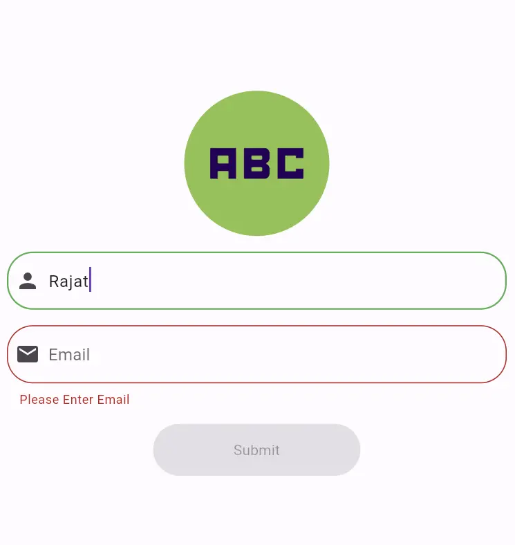
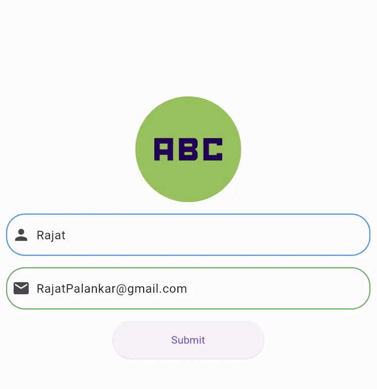
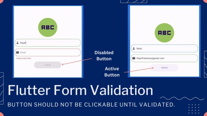
Hi Guy’s, Welcome to Proto Coders Point. In this Flutter Tutorial Article, We will Learn how to enhance user experience in your Flutter applications by enabling a feature i.e. A button should be clickable only when form Textfields data are properly validated.
Source Code – Flutter TextField Form Validation – Disable Button Until Form is Valid


As you all know that Form Validation is very important for user input, making sure that submitted form is valid and data is received or submitted is not empty or irrelevant.
In flutter we have 'Form' widget for implementing form validation. This Article is specially for integrating submit button disable or active state depending on validation of form.
Form Validation with GlobalKey
In flutter to validate the data entered into the textfield of the form we can utilize the GlobalKey<FormState>, This contains the functionality to validate the form & manage it state.
final GlobalKey<FormState> _formKey = GlobalKey<FormState>();
The _formKey is attached to Form Widget to enable the access to the form state and validate it’s functionality.
Managing Button State – Clickable or Disabled
The Form Widget has a property onChanged() which keep calling then use enter data in form textField.
Here to Control the state of the button, We have use a boolean variable that will be updated to true if _formKey.currentState!.validate() return true.
_formKey.currentState!.validate() => This function check if all the textField in the form meet with validated criteria. if validation is successful, the variable isValid is set to true.
bool isValid = false;

void onChange() {
  setState(() {
    isValid = _formKey.currentState!.validate();
  });
}
Now we can use this isValid variable to make button Clickable or NotClickable.
Button Activation with onPressed
Flutter Buttons onPressed when set to null, It means button is disable or NotClickable and the button color is set to grey automatically.
ElevatedButton(
         onPressed: isValid ? (){
                     // Do something
         } : null,
       child: Text("Submit"),

 ),
Here onPressed function is triggered only when isValid is true, Which ensure that the button remains inactive until the form is valid.
Complete Source Code
TextField InputDecoration Design
Create a File by name ‘input_TextFieldDecoration.dart’, The below code is just for giving stying to TextField
import 'package:flutter/material.dart';

InputDecoration buildInputDecoration(IconData icons,String hinttext) {
  return InputDecoration(
    hintText: hinttext,
    prefixIcon: Icon(icons),
    focusedBorder: OutlineInputBorder(
      borderRadius: BorderRadius.circular(25.0),
      borderSide: BorderSide(
          color: Colors.green,
          width: 1.5
      ),
    ),
    border: OutlineInputBorder(
      borderRadius: BorderRadius.circular(25.0),
      borderSide: BorderSide(
        color: Colors.blue,
        width: 1.5,
      ),
    ),
    enabledBorder:OutlineInputBorder(
      borderRadius: BorderRadius.circular(25.0),
      borderSide: BorderSide(
        color: Colors.blue,
        width: 1.5,
      ),
    ),
  );
}
FormPage.dart
import 'package:flutter/material.dart';
import 'input_TextFieldDecoration.dart';

class FormPage extends StatefulWidget {
  @override
  _FormPageState createState() => _FormPageState();
}

class _FormPageState extends State<FormPage> {

  late String name,email,phone;

  final GlobalKey<FormState> _formKey = GlobalKey<FormState>();

  bool isValid = false;

  void onChange(){
    setState(() {
      isValid = _formKey.currentState!.validate();
    });

  }

  @override
  Widget build(BuildContext context) {
    return Scaffold(
      body: Center(
        child: SingleChildScrollView(
          child: Form(
            key: _formKey,
            onChanged: (){
              onChange();
            },
            child: Column(
              mainAxisAlignment: MainAxisAlignment.center,
              children: [
                const CircleAvatar(
                  radius: 70,
                  backgroundColor: Colors.lightGreen,
                  child: Icon(Icons.abc_sharp,size: 120,),
                ),
                const SizedBox(
                  height: 15,
                ),
                Padding(
                  padding: const EdgeInsets.only(bottom:15,left: 10,right: 10),
                  child: TextFormField(
                    keyboardType: TextInputType.text,
                    decoration: buildInputDecoration(Icons.person,"Full Name"),
                    validator: (value){
                      if(value!.isEmpty){
                        return "Please Enter name";
                      }
                      return null;
                    },
                  ),
                ),
                Padding(
                  padding: const EdgeInsets.only(bottom: 15,left: 10,right: 10),
                  child: TextFormField(
                    keyboardType: TextInputType.text,
                    decoration:buildInputDecoration(Icons.email,"Email"),
                    validator: (value){
                      if(value!.isEmpty){
                        return "Please Enter Email";
                      }
                      // Rajat@gmail.com
                      if(!RegExp(r'^[a-zA-Z0-9._%+-]+@[a-zA-Z0-9.-]+\.[a-zA-Z]{2,}$').hasMatch(value)){
                        return 'Please a valid Email';
                      }


                      return null;
                    },
                  ),
                ),
                SizedBox(
                  width: 200,
                  height: 50,
                  child: ElevatedButton(
                    onPressed: isValid ? (){
                      ScaffoldMessenger.of(context).showSnackBar(SnackBar(content: Text("Valid Form")));
                    } : null,
                    child: Text("Submit"),
                  ),
                )
              ],
            ),
          ),
        ),
      ),
    );
  }
}
Conclusion
In this Flutter Code, we illustrated a straightforward implementation of form validation with button state management, dynamically making button active or inactive based on form validation.


