
Hi Guys, Welcome to Proto Coders Point. In this flutter tutorial(Article) we will learn how to give dotted border around any widget in flutter.
Note: to add dashed border or dotted border to our widget, we will make use of “flutter_dotted_border“ package. that let’s developer to easilt implement dotted border in flutter.
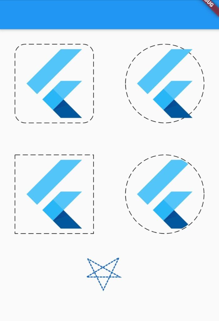
Output example
Video Tutorial
Installation of package
1. Run a command to install the package
flutter pub add dotted_border
In your IDE terminal type above command & enter. It will add line in pubspec.yaml file.
dependencies:
  dotted_border: ^2.0.0  #latest version
OR
Directly add it under dependencies section
Open pubspec.yaml file and under dependencies section add the border dotted library.
dependencies:
  dotted_border: ^2.0.0  #latest version
2. Import dotted_border.dart file
once you have added the package now you just need to import it wherever required.
import 'package:dotted_border/dotted_border.dart';
How to use usage
you just need towrapany of your widget where i want to give a border with DottedBorder widget.
Example: Snippet code
DottedBorder(
        child: FlutterLogo(
          size: 148,
        ),
  ),
Here in above snippet, I have a flutterLogo widget for which i want a border, so i have just wrapped it as above.
BorderType
giving bordershape and radius to it.
Rect
DottedBorder(
        child: FlutterLogo(
          size: 148,
        ),
        borderType: BorderType.Rect,
        dashPattern: [10,5,10,5,10,5], //optional
      ),

RRect BorderRadius
DottedBorder(
        child: FlutterLogo(
          size: 148,
        ),
        borderType: BorderType.RRect,
        radius: Radius.circular(20),
        dashPattern: [10,5,10,5,10,5],
      ),

Circle Border and oval Border

DottedBorder(
        child: FlutterLogo(
          size: 148,
        ),
        borderType: BorderType.Circle,
         dashPattern: [10,5,10,5,10,5],
      ),
DottedBorder(
          child: ClipOval(
              child: FlutterLogo(
            size: 148,
          )),
          borderType: BorderType.Oval,
          dashPattern: [10,5,10,5,10,5],
),

#image
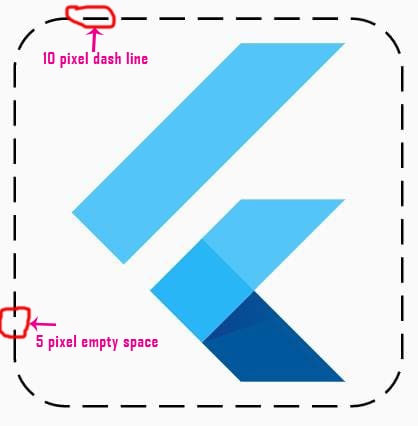
Dash Pattern
Then, if you want to customize the space between dash border, you can easily do it by property ‘dashPattern’ just specity the dash sequence by passing array list of pixel size of dash size & empty space.
DottedBorder(
        dashPattern: [10,5,10,5,10,5],
        child: FlutterLogo(
            size: 148,
          ),
    )
The above dash Pattern will build dash border in a sequence
Eg: 10 pixel wide dash.
5 pixel wide space.
10 pixel wide dash and so on until complete border is completed.
Custom painting dotted path border
let’s draw a star pattern in flutter
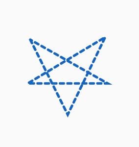
first create a custom paint path.
Path customPath = Path()
    ..moveTo(20, 20)
    ..lineTo(50, 80)
    ..lineTo(80, 18)
    ..lineTo(18, 55)
    ..lineTo(82, 55)
    ..lineTo(20, 20)
  ;
Now apply the line drawing path to dotted widget
DottedBorder(
            customPath: (size) => customPath, // PathBuilder
            color: Colors.blue.shade800,
            strokeCap: StrokeCap.round,
            dashPattern: [3, 3],
            strokeWidth: 2,
            child: Container(
              height: 120,
              width: 120,

            ),
          ),
Complete source code – flutter dotted border example
main.dart
In below code.
I am use GridView to build list of widget with dotted border.
firstly i have initialized 2 array list of type BorderType & and double list. In BorderType we have type such as RRect for show rounded rectangle, Rect to get simple rectangle border, circle to show fully rounded border and Oval to show oval shape in border.
Then this list is been passed through itemBuilder to create widget BuildBorderWidget.
import 'package:dotted_border/dotted_border.dart';
import 'package:flutter/cupertino.dart';
import 'package:flutter/material.dart';

void main() {
  runApp(MyApp());
}

class MyApp extends StatelessWidget {
  // This widget is the root of your application.
  @override
  Widget build(BuildContext context) {
    return MaterialApp(
      title: 'Flutter Demo',
      theme: ThemeData(
        primarySwatch: Colors.blue,
      ),
      home: MyHomePage(),
    );
  }
}

class MyHomePage extends StatefulWidget {
  @override
  _MyHomePageState createState() => _MyHomePageState();
}

class _MyHomePageState extends State<MyHomePage> {
 // create a list of bordertype so
  List<BorderType> borderTypeList = [
    BorderType.RRect,
    BorderType.Circle,
    BorderType.Rect,
    BorderType.Oval
  ];
  List<double> radiusnumber = [20, 0, 20, 0];

  Path customPath = Path()
    ..moveTo(20, 20)
    ..lineTo(50, 80)
    ..lineTo(80, 18)
    ..lineTo(18, 55)
    ..lineTo(82, 55)
    ..lineTo(20, 20)
  ;

  @override
  Widget build(BuildContext context) {
    return Scaffold(
      appBar: AppBar(),
      body: SingleChildScrollView(
        child: Center(
          child: Column(
            mainAxisAlignment: MainAxisAlignment.center,
            children: [
              GridView.builder(
                  shrinkWrap: true,
                  physics: ScrollPhysics(),
                  itemCount: borderTypeList.length,
                  gridDelegate: SliverGridDelegateWithFixedCrossAxisCount(
                      crossAxisCount: 2, crossAxisSpacing: 4.0, mainAxisSpacing: 4),
                  itemBuilder: (BuildContext context, int index) {
                    return BuildBorderWidget(
                        borderTypeList[index], radiusnumber[index]);   // call custom widget to build it.
                  }
         ),

         // draws star shape pattern
          DottedBorder(
            customPath: (size) => customPath, // PathBuilder
            color: Colors.blue.shade800,
            strokeCap: StrokeCap.round,
            dashPattern: [3, 3],
            strokeWidth: 2,
            child: Container(
              height: 120,
              width: 120,

            ),
          ),
            ],
          ),
        ),
      ),
    );
  }
}

// this custom widget is been called from GridView.builder
Widget BuildBorderWidget(BorderType borderType, double radius) {
  return Center(
      child: DottedBorder(
        dashPattern: [10,5,10,5,10,5],
        child: borderType == BorderType.Oval ? ClipOval(
        child: FlutterLogo(
        size: 148,
      ),
    ) : FlutterLogo(
      size: 148,
    ),
    borderType: borderType,
    radius: Radius.circular(radius),
  ));
}
Output
")


