
")


Welcome To Proto Coders Point, In this tutorial, we will learn how to create a profile page UI Design app using Dart and Flutter. A quick sample app on how to create a simple profile screen page in flutter.
Similar profile page UI design 2
Flutter Profile Page UI Design Using Flutter Card & ListTile Widget
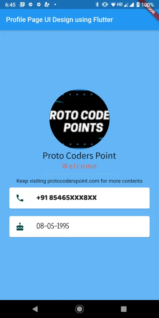
The Final UI of Flutter profile page will look something like below screenshot.
Video Tutorial play here
Open android Studio and create a new flutter project.
File > New > New Flutter Project
Give a name you your flutter project and set a path to store you flutter project.
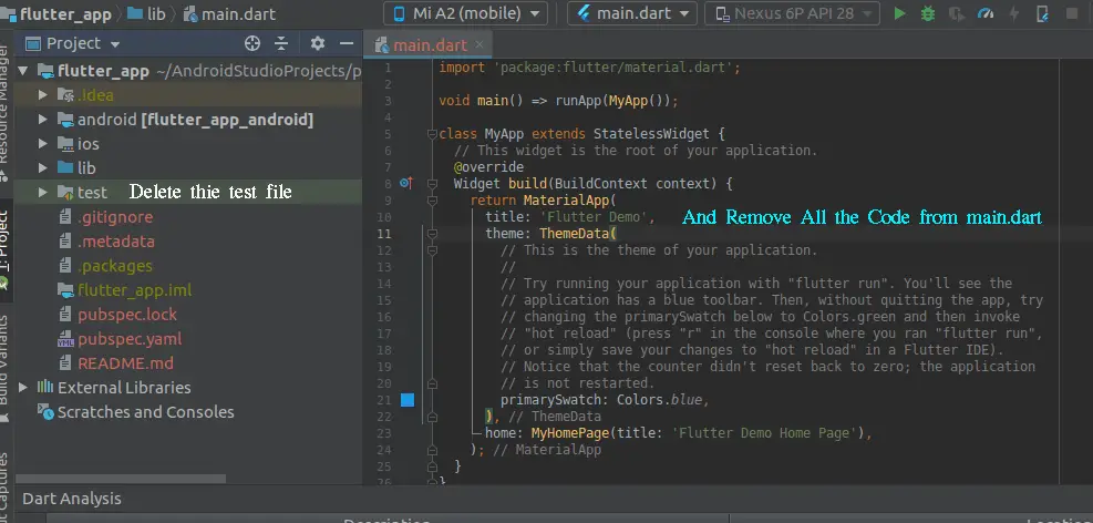
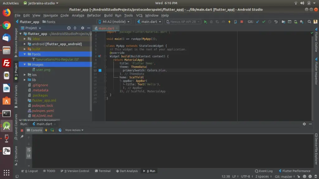
Now you will a see a default counter code generated, that simply counts the number of times the button is pressed and display counting on the screeen.
You can just remove default code of flutter and shown in below Image.
So let’s begin with the actual code for Flutter profile page example UI Design.
before we start implement, we need the resources such as images and fonts to be set/copy in our project directory, For that we need to create 2 directory.
Directory
- images : to store all our project image resources.
- fonts : to store all our fonts style ttf extension files.
Here is how to create directory in android-studio ( flutter )
Right Click on project > New > Directory
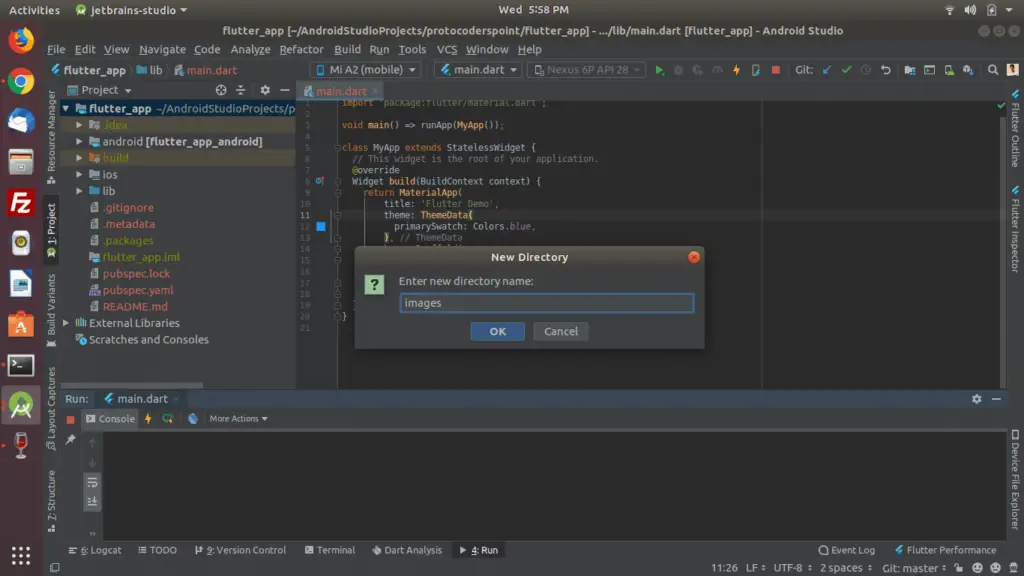
like wise create a 2nd directory name “fonts”
download an icon and fonts from google

Copy both the image and fonts file in those directorys.
NOTE: you also need to initialize the resources in pubspec.yaml file
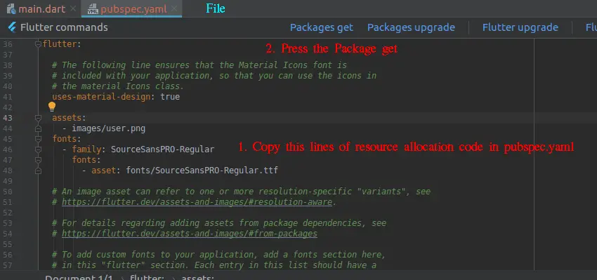
assets:
    - images/user.png
  fonts:
    - family: SourceSansPRO-Regular
      fonts:
        - asset: fonts/SourceSansPRO-Regular.ttf
Please check the indentation ( Many programmer face problems while setting resources package )
Source Code of Flutter Profile UI Design
main.dart
import 'package:flutter/material.dart';

void main() {
  runApp(MyApp());
}

class MyApp extends StatelessWidget {
  @override
  Widget build(BuildContext context) {
    // TODO: implement build
    return MaterialApp(
      home: Scaffold(
        appBar: AppBar(
          title: Text(
            "Profile Page UI Design using Flutter ",
            style: TextStyle(fontSize: 18.0),
          ),
        ),
        backgroundColor: Colors.blue[300],
        body: SafeArea(
          child: Center(
            child: Column(
              mainAxisAlignment: MainAxisAlignment.center,
              children: <Widget>[
                CircleAvatar(
                  radius: 80,
                  backgroundImage: AssetImage('images/protocoder.png'),
                ),
                Text(
                  'Proto Coders Point',
                  style: TextStyle(
                    fontFamily: 'SourceSansPro',
                    fontSize: 25,
                  ),
                ),
                Text(
                  'Welcome',
                  style: TextStyle(
                    fontSize: 20,
                    fontFamily: 'SourceSansPro',
                    color: Colors.red[400],
                    letterSpacing: 2.5,
                  ),
                ),
                SizedBox(
                  height: 20.0,
                  width: 200,
                  child: Divider(
                    color: Colors.teal[100],
                  ),
                ),
                Text("Keep visiting protocoderspoint.com for more contents"),
                Card(
                    color: Colors.white,
                    margin:
                        EdgeInsets.symmetric(vertical: 10.0, horizontal: 25.0),
                    child: ListTile(
                      leading: Icon(
                        Icons.phone,
                        color: Colors.teal[900],
                      ),
                      title: Text(
                        '+91 85465XXX8XX',
                        style:
                            TextStyle(fontFamily: 'BalooBhai', fontSize: 20.0),
                      ),
                    )),
                Card(
                  color: Colors.white,
                  margin:
                      EdgeInsets.symmetric(vertical: 10.0, horizontal: 25.0),
                  child: ListTile(
                    leading: Icon(
                      Icons.cake,
                      color: Colors.teal[900],
                    ),
                    title: Text(
                      '08-05-1995',
                      style: TextStyle(fontSize: 20.0, fontFamily: 'Neucha'),
                    ),
                  ),
                )
              ],
            ),
          ),
        ),
      ),
    );
  }
}
Explaination of flutter widget used in the above code.
Flutter Card Class
A material design card. A card has slightly rounded corners and a shadow.
A card is a sheet of Material used to represent some related information, for example an album, a geographical location, a meal, contact details, etc.
In the above lines of code Flutter Card i have used child that contains ListTile widget class with leading icons and title.
Read more above flutter card on official site.
ListTile class
A single fixed-height row that typically contains some text as well as a leading or trailing icon.
It is the responsibility of the caller to ensure that title does not wrap, and to ensure that subtitle doesn’t wrap.
In the above lines of code Flutter ListTile class that has leading with icons and title with text.
SizedBox Widget Class
A box with a specified size.
If given a child, this widget forces its child to have a specific width and/or height .
In the above code you can observe their is a tiny empty space in between call icon and phone number text
Divider Widget Class
thin horizontal line, with padding on either side.
In the material design language, this represents a divider. Dividers can be used in lists, Drawers, and elsewhere to separate content.
If you are new in flutter development check this post to learn about how to install fluttter in android studio


[…] In the Below Example of AsyncTask We are performing a network operation, where we gonna fetch data from JSON File and Display them in our UI. […]
[…] Hi Guys, Welcome to Proto Coders Point, In this Flutter Tutorial we gonna use http flutter library to Fetch data from Internet which is in JSON format and display the data in Flutter ListView builder with ListTile widget. […]
[…] Even check out profile page UI Design […]
[…] Guys, Welcome to Proto Coders Point, In this Flutter tutorial, we will learn how to create a profile page UI Design app using Dart and Flutter. A quick sample app on how to implement a flutter profile […]