
Hi Guys, Welcome to Proto Codes Point, In this flutter tutorial we check how to show snackbar with flutter app development.
What is Snackbar in mobile app?
A Flutter Snackbar is Quick Information to the user of your application. Using material design snackbar you can give a quick message, error or warning message to the app user, One of the best and the most useful way of showing message is by using Flutter Material Snackbar.
But using Flutter default snackbars is not at all great now, This drawbacks of default snackbar we can solve with the use of Flutter Flushbar Library.
Flutter Flushbar plugin libray will work same like snackbars but the think is you can easily customize the snackbar as per you wish and it’s very much simple to use.
Flutter Flushbar library
After Creating a new Flutter project in your Favourite IDE platform like android studio or VSCode….
Adding dependencies
Then to add flushbar dependencies,
open pubspec.yaml file and all the following dependencies
dependencies:
  flushbar: ^1.10.4
then, after adding hit the Pub get (to download the library).
get latest version on official site here.
Import the package
Then import flushbar package wherever you need to display snackbar to show some information.
import 'package:flushbar/flushbar.dart';
import 'package:flushbar/flushbar_helper.dart';
Now start using flushbar widget
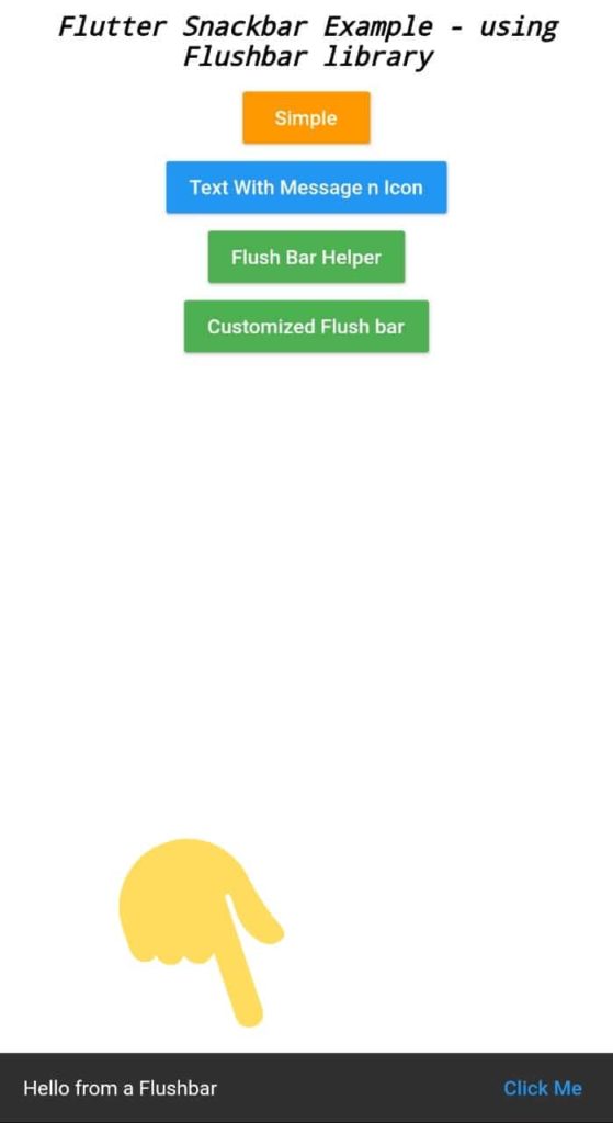
1. Simple Flushbar
This Simple Flushbar will displaybasically a copy of default Snackbar that by using Flushbar library,
To make it bit change i have added a simple click me button to it.
//Simple Flushbar with a button
void show_Simple_Flushbar(BuildContext context) {
  Flushbar(
    // There is also a messageText property for when you want to
    // use a Text widget and not just a simple String
    message: 'Hello from a Flushbar',
    // Even the button can be styled to your heart's content
    mainButton: FlatButton(
      child: Text(
        'Click Me',
        style: TextStyle(color: Theme.of(context).accentColor),
      ),
      onPressed: () { print("Simple snackbar example");},
    ),
    duration: Duration(seconds: 3),
    // Show it with a cascading operator
  )..show(context);

}
The above snippet code is just a method by calling with a button press will show snackbar to the user. To call the Function you can just make use of MaterialButton widget.
As you can check that there’s no Scaffold or any boilerplate code, and it’s very easy to make snackbar styleable.
Output of simple Flushbar
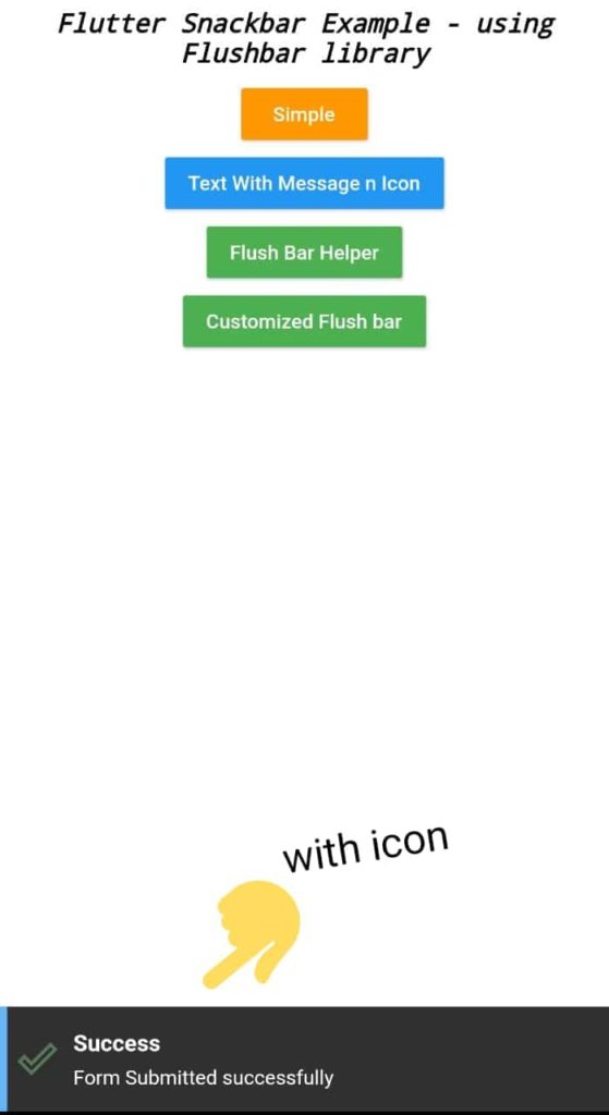
Snackbar with Icons and more Information
Showing only Textual Info to user is not enough, Sometimes, we also need to show different kinds of information like warning, error message with some Icons on snackbar and Snackbar with different color, and thus it very easy to implement customized snackbar using Flushbar library.
void show_Title_n_message_Flushbar(BuildContext context) {
  Flushbar(
    title: 'Success',
    message: 'Form Submitted successfully',
    icon: Icon(
      Icons.done_outline,
      size: 28,
      color: Colors.green.shade300,
    ),
    leftBarIndicatorColor: Colors.blue.shade300,
    duration: Duration(seconds: 3),
  )..show(context);
}
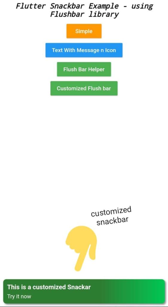
Fully Customized Flutter Snackbar
Showing Snackbar using Flushbar library does not end here at just showing information or any message. You can really make use of this Flutter Flushbar library to customize snackbar as per you creativity,
This library can be customized in a sense like maing it rounded border, giving gradient background to snackbar and also custom animation or shadow effect.
void show_Custom_Flushbar(BuildContext context) {
  Flushbar(
    duration: Duration(seconds: 3),
    margin: EdgeInsets.all(8),
    padding: EdgeInsets.all(10),
    borderRadius: 8,
    backgroundGradient: LinearGradient(
      colors: [Colors.green.shade800, Colors.greenAccent.shade700],
      stops: [0.6, 1],
    ),
    boxShadows: [
      BoxShadow(
        color: Colors.black45,
        offset: Offset(3, 3),
        blurRadius: 3,
      ),
    ],
    // All of the previous Flushbars could be dismissed by swiping down
    // now we want to swipe to the sides
    dismissDirection: FlushbarDismissDirection.HORIZONTAL,
    // The default curve is Curves.easeOut
    forwardAnimationCurve: Curves.fastLinearToSlowEaseIn,
    title: 'This is a floating Flushbar',
    message: 'Lorem ipsum dolor sit amet',
  )..show(context);
}
output
Customization doesn’t stop here, There are more properties of flushbar that you can use to modify snackbar. Please visit official site to learn more about Flushbar library.
Complete Flutter Flushbar code
Copy paste below lines of code in main.dart file
main.dart
import 'package:flutter/material.dart';
import 'package:flushbar/flushbar.dart';
import 'package:flushbar/flushbar_helper.dart';

void main() {
  runApp(MyApp());
}

class MyApp extends StatelessWidget {
  // This widget is the root of your application.
  @override
  Widget build(BuildContext context) {
    return MaterialApp(
      title: 'Flutter FlushBar Example ',
      debugShowCheckedModeBanner: false,
      theme: ThemeData(
        primarySwatch: Colors.blue,
        visualDensity: VisualDensity.adaptivePlatformDensity,
      ),
      home: MyHomePage(),
    );
  }
}

class MyHomePage extends StatefulWidget {
  @override
  _MyHomePageState createState() => _MyHomePageState();
}

class _MyHomePageState extends State<MyHomePage> {
  @override
  Widget build(BuildContext context) {
    return SafeArea(
      child: Container(
        color: Colors.white,
        child: Column(
          crossAxisAlignment: CrossAxisAlignment.center,
          children: <Widget>[
            Padding(
              padding: const EdgeInsets.all(8.0),
              child: Text("Flutter Snackbar Example - using Flushbar library",style: TextStyle(fontSize: 18,color: Colors.black,fontStyle: FontStyle.italic,decoration: TextDecoration.none),textAlign: TextAlign.center,),
            ),
            MaterialButton(
              child: Text("Simple",style: TextStyle(color: Colors.white),),
              color: Colors.orange,
              onPressed: (){
                show_Simple_Flushbar(context);
              },
            ),
            MaterialButton(
              child: Text("Text With Message n Icon",style: TextStyle(color: Colors.white),),
              color: Colors.blue,
              onPressed: (){
                show_Title_n_message_Flushbar(context);
              },
            ),
            MaterialButton(
              child: Text("Flush Bar Helper",style: TextStyle(color: Colors.white),),
              color: Colors.green,
              onPressed: (){
                show_FlushbarHelper(context);
              },
            ),
            MaterialButton(
              child: Text("Customized Flush bar",style: TextStyle(color: Colors.white),),
              color: Colors.green,
              onPressed: (){
                show_Custom_Flushbar(context);
              },
            ),
          ],
        ),
      ),
    );
  }
}

//Simple Flushbar with a button
void show_Simple_Flushbar(BuildContext context) {
  Flushbar(
    // There is also a messageText property for when you want to
    // use a Text widget and not just a simple String
    message: 'Hello from a Flushbar',
    // Even the button can be styled to your heart's content
    mainButton: FlatButton(
      child: Text(
        'Click Me',
        style: TextStyle(color: Theme.of(context).accentColor),
      ),
      onPressed: () {},
    ),
    duration: Duration(seconds: 3),
    // Show it with a cascading operator
  )..show(context);

}

void show_Title_n_message_Flushbar(BuildContext context) {
  Flushbar(
    title: 'Success',
    message: 'Form Submitted successfully',
    icon: Icon(
      Icons.done_outline,
      size: 28,
      color: Colors.green.shade300,
    ),
    leftBarIndicatorColor: Colors.blue.shade300,
    duration: Duration(seconds: 3),
  )..show(context);
}

void show_FlushbarHelper(BuildContext context) {
  FlushbarHelper.createInformation(
    title: 'Exit',
    message: 'Do you want to close the app ?',
  ).show(context);
}


void show_Custom_Flushbar(BuildContext context) {
  Flushbar(
    duration: Duration(seconds: 3),
    margin: EdgeInsets.all(8),
    padding: EdgeInsets.all(10),
    borderRadius: 8,
    backgroundGradient: LinearGradient(
      colors: [Colors.green.shade800, Colors.greenAccent.shade700],
      stops: [0.6, 1],
    ),
    boxShadows: [
      BoxShadow(
        color: Colors.black45,
        offset: Offset(3, 3),
        blurRadius: 3,
      ),
    ],
    // All of the previous Flushbars could be dismissed by swiping down
    // now we want to swipe to the sides
    dismissDirection: FlushbarDismissDirection.HORIZONTAL,
    // The default curve is Curves.easeOut
    forwardAnimationCurve: Curves.fastLinearToSlowEaseIn,
    title: 'This is a customized Snackar',
    message: 'Try it now ',
  )..show(context);
}
Conclusion
Yes Flutter provides its own Snackbar, but the only drawable of default is it create lots of boilerplate code and is not as per customizable, so making use of Flushbar library will remove this drawable and you can easily style as per you creativity that too without any scafford.
This library is useful when you want to show more that a simple message.
")


[…] of default is it create lots of boilerplate code and is not as per customizable, so making use of Flutter Flushbar library will remove this drawable and you can easily style as per you creativity that too without any […]