
Hi Guys, Welcome to Proto Coders Point, In this Flutter Tutorial example we will create a Bottom Navigation Bar by using Curved Navigation Bar Library.
Introduction to Curved Bottom Navigation bar Flutter Library
By using this flutter package library you can easily create a Home Page/MainPage with Animated Bottom Navigation bar, This Flutter UI Library is very easy to implementation of curved navigation bar.
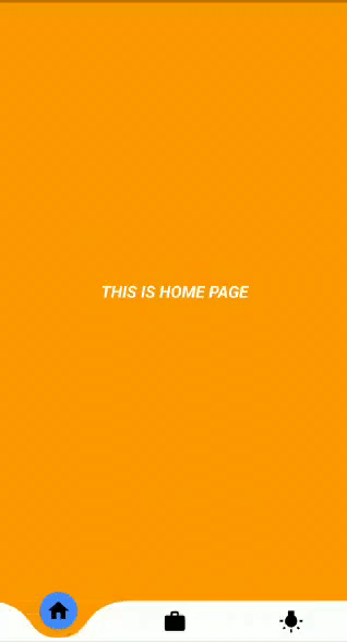
DEMO ON FINAL RESULT OF THIS FLUTTER TUTORIAL
Adding this Curved Bottom Navigation bar library in our flutter Project
Step 1: Adding the Dependencies
dependencies:
  curved_navigation_bar: ^0.3.2 #latest version
Once, you add the dependencies you need to click on pub get button/text, What it does is it download all the required classes or library in you flutter project.
Step 2: Importing the library wherever required to use
import 'package:curved_navigation_bar/curved_navigation_bar.dart';
for example: if you want to add curved bottom navigation bar in main page of your flutter application, then open main.dart file and add the import package line on top.
Snippet code of how to use this library
Scaffold(
  bottomNavigationBar: CurvedNavigationBar(
    backgroundColor: Colors.blueAccent,
    items: <Widget>[
      Icon(Icons.add, size: 30),
      Icon(Icons.list, size: 30),
      Icon(Icons.compare_arrows, size: 30),
    ],
    onTap: (index) {
      //Handle button tap
    },
  ),
  body: Container(color: Colors.blueAccent),
)
In Scaffold widget, we have an option to add bottomNavigationBar where you can add your own custom Navigation bar or any of the ready name library.
Different Customizable Attributes of this Library
items : This accepts any kind of widgets. for eg : Icons in our case
index : can be used to change current navigation bar or to set initial index when the app starts
color: to set Color of the bar, by default colors is been set to white.
buttonBackgroundColor: used to color of floating button on the bar. default is white.
backgroundColor : this color will be visible to the active bar or index.
onTap: trigger when used want to change the page or want to see any other contents.
animationCurve: Curves interpolating button change animation, default Curves.easeOutCubic, There are many more Curves animation you many like to use.
for more Curvers animation transaction effect visit here
animationDuration: Duration of button change animation, default Duration(milliseconds: 600).
height: Height of NavigationBar, min 0.0, max 75.0.
Then, thus we have learned more about this library.
Flutter Animated Bottom Navigation bar – Complete Code Flutter Examples
Create a new Flutter Project and add the dependencies in pubspec.yaml file as described in above Steps
Then, create 3 new dart pages
- HomePage.dart
- WorkPage.dart
- IdeaPage.dart
No need to give same name, you can name it as per you choice,
To create those pages follow this steps:
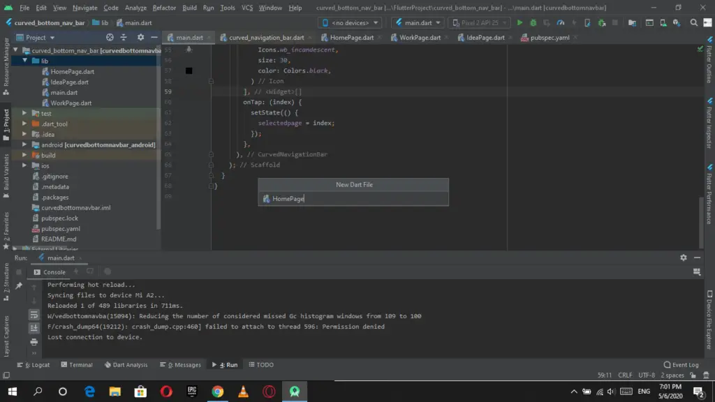
(Right Click) Lib > New > Dart File
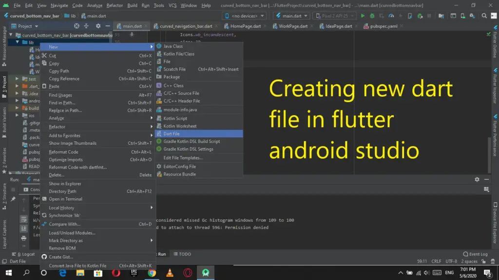
Give a name to the dart file
Then add the following flutter dart code into those dart files.
HomePage.dart
import 'package:flutter/material.dart';

class HomePage extends StatelessWidget {
  @override
  Widget build(BuildContext context) {
    return Scaffold(
      backgroundColor: Colors.orange,
      body: Center(
        child: Container(
          child: Text(
            "THIS IS HOME PAGE",
            style: TextStyle(
                color: Colors.white,
                fontSize: 20,
                fontStyle: FontStyle.italic,
                fontWeight: FontWeight.w700),
          ),
        ),
      ),
    );
  }
}
WorkPage.dart
import 'package:flutter/material.dart';

class WorkPage extends StatelessWidget {
  @override
  Widget build(BuildContext context) {
    return Scaffold(
      backgroundColor: Colors.pink,
      body: Center(
        child: Container(
          child: Text(
            "THIS IS WORK PAGE",
            style: TextStyle(
                color: Colors.white,
                fontSize: 20,
                fontStyle: FontStyle.italic,
                fontWeight: FontWeight.w700),
          ),
        ),
      ),
    );
  }
}
IdeaPage.dart
import 'package:flutter/material.dart';

class IdeaPage extends StatelessWidget {
  @override
  Widget build(BuildContext context) {
    return Scaffold(
      backgroundColor: Colors.greenAccent,
      body: Center(
        child: Container(
          child: Text(
            "THIS IS IDEA PAGE",
            style: TextStyle(
                color: Colors.white,
                fontSize: 20,
                fontStyle: FontStyle.italic,
                fontWeight: FontWeight.w700),
          ),
        ),
      ),
    );
  }
}
The above 3 pages will get replaced/displayed when uses click or Tap on any of the Bottom Navigation bar.
Final the main page where all the activity happens
main.dart
import 'package:curved_navigation_bar/curved_navigation_bar.dart';
import 'package:curvedbottomnavbar/HomePage.dart';
import 'package:curvedbottomnavbar/IdeaPage.dart';
import 'package:curvedbottomnavbar/WorkPage.dart';
import 'package:flutter/material.dart';

void main() => runApp(MyApp());

class MyApp extends StatelessWidget {
  // This widget is the root of your application.
  @override
  Widget build(BuildContext context) {
    return MaterialApp(
      debugShowCheckedModeBanner: false,
      title: 'Flutter Curved Novigation Bar',
      theme: ThemeData(
        primarySwatch: Colors.blue,
      ),
      home: MyHomePage(),
    );
  }
}

class MyHomePage extends StatefulWidget {
  @override
  _MyHomePageState createState() => _MyHomePageState();
}

class _MyHomePageState extends State<MyHomePage> {

  int selectedpage = 0; //initial value

  final _pageOptions = [HomePage(), WorkPage(), IdeaPage()]; // listing of all 3 pages index wise

  final bgcolor = [Colors.orange, Colors.pink, Colors.greenAccent];  // changing color as per active index value

  @override
  Widget build(BuildContext context) {
    return Scaffold(
      body: _pageOptions[selectedpage], // initial value is 0 so HomePage will be shown
      bottomNavigationBar: CurvedNavigationBar(
        height: 50,
        buttonBackgroundColor: Colors.blueAccent,
        backgroundColor: bgcolor[selectedpage],
        color: Colors.white,
        animationCurve: Curves.linearToEaseOut,
        items: <Widget>[
          Icon(
            Icons.home,
            size: 30,
            color: Colors.black,
          ),
          Icon(
            Icons.work,
            size: 30,
            color: Colors.black,
          ),
          Icon(
            Icons.wb_incandescent,
            size: 30,
            color: Colors.black,
          )
        ],
        onTap: (index) {
          setState(() {
            selectedpage = index;  // changing selected page as per bar index selected by the user
          });
        },
      ),
    );
  }
}
")


