/home/rajat/Downloads/flutter toggle buttons app development
flutter toggle buttons app development

Hi Guys welcome to Proto Coders Point. In the Post we will learn how to implement a Widget that is a ToggleButton in Flutter App development.

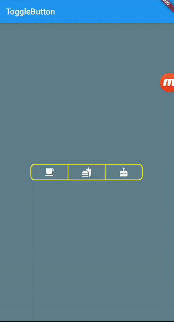
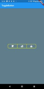
This is How the Final Flutter App Output will look like

flutter app development toggle button

What is a ToggleButton Widget?

Checked / unchecked (On / Off)  status can be displayed on the button using the a ToggleButton widget. If the user has to change the setting between two states, it is beneficial. On / Off Audio Sound, Wifi etc. In such case we make user of a Togglebutton in web, android or flutter app development.

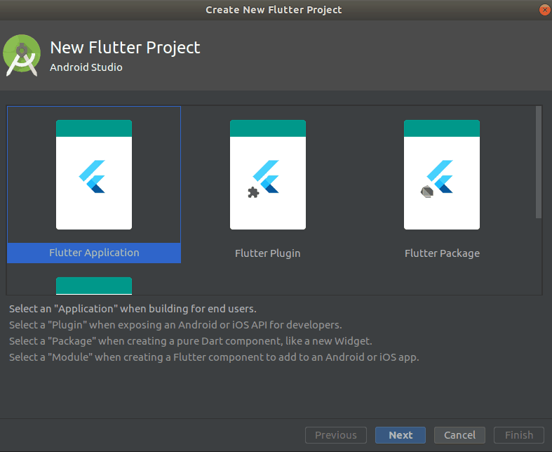
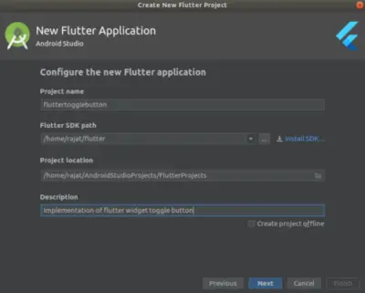
Implementation of Togglebutton in flutter app development using android-studio.

So lets begin the implementation of ToggleButton, I am using android-studio to build the app.

Learn more about flutter togglebutton class on official site.

Creating a new Flutter Project in android-studio

creating-new-flutter-project-in-android-studio
New > New Flutter Project > Select Flutter Application

Give a name to you flutter app project > select destination path > NEXT

ToggleButton Flutter widget Code.

ToggleButtons(
  children: <Widget>[
    Icon(Icons.ac_unit),
    Icon(Icons.call),
    Icon(Icons.cake),
  ],
  onPressed: (int index) {
    setState(() {
      isSelected[index] = !isSelected[index];
    });
  },
  isSelected: isSelected,
),

Here, we have a ToggleButtons which has children array of widget which consist of 3 Icons, which allows for multiple Buttons to be simultaneously selected.

Complete code for implementation of flutter widget ToggleButtons

main.dart

import 'package:flutter/material.dart';

void main() => runApp(MyApp());

class MyApp extends StatelessWidget {
  // This widget is the root of your application.
  @override
  Widget build(BuildContext context) {
    return MaterialApp(
        title: 'Flutter Demo',
        home: Scaffold(
          backgroundColor: Colors.blueGrey,
          appBar: AppBar(
            title: Text("ToggleButton"),
          ),
          body: MainPage(),
        ));
  }
}

class MainPage extends StatefulWidget {
  @override
  _MainPageState createState() => _MainPageState();
}

class _MainPageState extends State<MainPage> {
  List<bool> _selection = List.generate(3, (_) => false);
  @override
  Widget build(BuildContext context) {
    return Center(
      child: ToggleButtons(
        children: <Widget>[
          Icon(Icons.local_cafe),
          Icon(Icons.fastfood),
          Icon(Icons.cake)
        ],
        borderColor: Colors.yellowAccent,
        color: Colors.white,
        borderRadius: BorderRadius.circular(10),
        borderWidth: 2,
        isSelected: _selection,
        onPressed: (int index) {
          setState(() {
            _selection[index] = !_selection[index];
          });
        },
      ),
    );
  }
}

Output of above code.

toggle button flutter

Properties of Flutter ToggleButton.

borderColor : Used to display a border Color when button is selected and unselected.

borderRadius : used to give a circular border to the buttons.

borderWidth : To set the width size of button borderwidth.

borderColor: Colors.grey,
color: Colors.green,
borderRadius: BorderRadius.circular(10),
borderWidth: 2,

selectedColor : Colors.orange : This property will get activated whichever button is been selected.

selectedBorderColor: Colors.white :  This property is used to display a customized border color on the selected button.

There are many other Properties that will help you in Customizing the toggle buttons

Check out the official flutter site to learn more about its properties


Comments are closed.