Hi Guys, Welcome to Proto Coders Point, In this Android Github library tutorial we will discuss and implement Facebook Shimmer Effect library which is easy to implement, and a flexible way to add a shimmering effect to any view in an Android app.
What is Shimmer Effect?
A Shimmer Effect is just an shine effect on any of the View like text, images or any widget.
Shimmer is one of the Android github library that is one of the easiest way to add an shimmer effect to a views in android xml layout.
Now a day it is mostly used as loading indicator.
Facebook shimmer android effect is been implemented in the layout file, That means we can simple nest any number of android views inside a ShimmerFrameLayout tag. and just you need to initialize and call the start or stop shimmer method to begin animation effect.
Ok let’s begin adding the Library in our android project
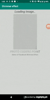
Final Result of the Below Complete Code
youtube video Tutorial on Facebook Shimmer android example
Implementation of Facebook shimmer effect library
1. Adding dependencies in your project
To include Shimmer in your project, add the following dependency:
Project > App > Gradle Script > Open build.gradle(module.app)
// Gradle dependency on Shimmer for Android
dependencies {
  implementation 'com.facebook.shimmer:shimmer:0.5.0'
}
then after adding library just click on sync now and now all set shimmer library is added in project successfully.
The above snippet code will show how you can use the Library view.
you can also initialize to auto_start to start the shimmer animation
there are many other attributes of this library
Attributes
You can control the look and pace of the effect using a number of custom attributes on the ShimmerFrameLayout tag.
Clip to Children
Whether to clip the shimmering effect to the children, or to opaquely draw the shimmer on top of the children. Use this if your overall layout contains transparency.
Colored
Whether you want the shimmer to affect just the alpha or draw colors on-top of the children.
Base Color
If colored is specified, the base color of the content.
Highlight Color
If colored is specified, the shimmer’s highlight color.
Base Alpha
If colored is not specified, the alpha used to render the base view i.e. the unhighlighted view over which the highlight is drawn.
Highlight Alpha
If colored is not specified, the alpha of the shimmer highlight.
Auto Start
Whether to automatically start the animation when the view is shown, or not.
Duration
Time it takes for the highlight to move from one end of the layout to the other.
Repeat Count
Number of times of the current animation will repeat.
Repeat Delay
Delay after which the current animation will repeat.
Repeat Mode
What the animation should do after reaching the end, either restart from the beginning or reverse back towards it.
Direction
The travel direction of the shimmer highlight: left to right, top to bottom, right to left or bottom to top.
Dropoff
Controls the size of the fading edge of the highlight.
Intensity
Controls the brightness of the highlight at the center
Shape
Shape of the highlight mask, either with a linear or a circular gradient.
Tilt
Angle at which the highlight is tilted, measured in degrees
Fixed Width, Height
Fixed sized highlight mask, if set, overrides the relative size value
Width, Height ratio
Size of the highlight mask, relative to the layout it is applied to.

")


