
")


Hi Guys, Welcome to Proto Coders Point, In this flutter article we will implement button in flutter to show a progress or loading indication, useful when a form is been submitted.
- Loading Spinner Indicator on Button – Flutter:
Useful, when user is submittiing a form & has to wait until form submittion is successful. In that case, we can show a Circular Progress Indicator like showing a loading spinner on a button until form is submitted.
- Animated Loading Button State – Flutter
Here we will create 3 state of a button Indication.
1. ButtonState.init: initial state of a button (before submitting).

2. ButtonState.submitting: A state to indicate user that the form is getting submitting to the server & user need to wait. This state is loading/progress just to show circular Progress.

3. ButtonState.completed: A state to indicate that the from is submitted successfuly.

Note: This Article source code is just the UI to create a loading button in flutter ( this is not a real time form submission example)
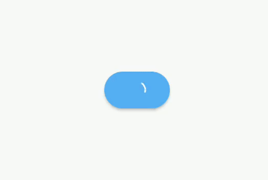
Example 1: Flutter Code – Loading Circular Spinner Button
Code – main.dart
import 'package:flutter/material.dart';

void main() {
  runApp(const MyApp());
}

class MyApp extends StatelessWidget {
  const MyApp({Key? key}) : super(key: key);

  // This widget is the root of your application.
  @override
  Widget build(BuildContext context) {
    return MaterialApp(
      title: 'Flutter Demo',
      theme: ThemeData(
        primarySwatch: Colors.blue,
      ),
      home: const MyHomePage(),
    );
  }
}

//loading spinner on button
class MyHomePage extends StatefulWidget {
  const MyHomePage({Key? key}) : super(key: key);

  @override
  _MyHomePageState createState() => _MyHomePageState();
}

class _MyHomePageState extends State<MyHomePage> {
  bool isLoading = false;

  @override
  Widget build(BuildContext context) {
    return Scaffold(
      body: Center(
        child: Container(
          height: 70,
          width: MediaQuery.of(context).size.width,
          alignment: Alignment.center,

          child: ElevatedButton(
            style: ElevatedButton.styleFrom(shape: StadiumBorder()),
            onPressed: () async {
              setState(() {
                isLoading = true;
              });
              await Future.delayed(const Duration(seconds: 5));
              setState(() {
                isLoading = false;
              });
            },
            child: (isLoading)
                ? const SizedBox(
                    width: 16,
                    height: 16,
                    child: CircularProgressIndicator(
                      color: Colors.white,
                      strokeWidth: 1.5,
                    ))
                : const Text('Submit'),
          ),
        ),
      ),
    );
  }
}
Output of above code
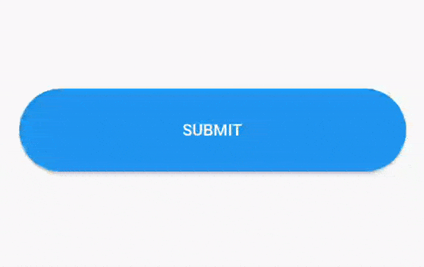
Example 2: Flutter Code – Animated Loading Circular Button State
Code – main.dart
Read the comment in below code for understanding the code flow:
import 'package:flutter/material.dart';

void main() {
  runApp(const MyApp());
}

class MyApp extends StatelessWidget {
  const MyApp({Key? key}) : super(key: key);

  // This widget is the root of your application.
  @override
  Widget build(BuildContext context) {
    return MaterialApp(
      title: 'Flutter Demo',
      theme: ThemeData(
        primarySwatch: Colors.blue,
      ),
      home: const ButtonStates(),
    );
  }
}
bool isAnimating = true;

//enum to declare 3 state of button
enum ButtonState { init, submitting, completed }

class ButtonStates extends StatefulWidget {
  const ButtonStates({Key? key}) : super(key: key);

  @override
  _ButtonStatesState createState() => _ButtonStatesState();
}

class _ButtonStatesState extends State<ButtonStates> {
  ButtonState state = ButtonState.init;

  @override
  Widget build(BuildContext context) {
    final buttonWidth = MediaQuery.of(context).size.width;

    // update the UI depending on below variable values
    final isInit = isAnimating || state == ButtonState.init;
    final isDone = state == ButtonState.completed;

    return Scaffold(
      body: Container(
        alignment: Alignment.center,
        padding: EdgeInsets.all(40),
        child: AnimatedContainer(
            duration: Duration(milliseconds: 300),
            onEnd: () => setState(() {
                  isAnimating = !isAnimating;
                }),
            width: state == ButtonState.init ? buttonWidth : 70,
            height: 60,
            // If Button State is Submiting or Completed  show 'buttonCircular' widget as below
            child: isInit ? buildButton() : circularContainer(isDone)),
      ),
    );
  }

  // If Button State is init : show Normal submit button
  Widget buildButton() => ElevatedButton(
        style: ElevatedButton.styleFrom(shape: const StadiumBorder()),
        onPressed: () async {
          // here when button is pressed
          // we are changing the state
          // therefore depending on state our button UI changed.
          setState(() {
            state = ButtonState.submitting;
          });

          //await 2 sec // you need to implement your server response here.
          await Future.delayed(Duration(seconds: 2));
          setState(() {
            state = ButtonState.completed;
          });
          await Future.delayed(Duration(seconds: 2));
          setState(() {
            state = ButtonState.init;
          });
        },
        child: const Text('SUBMIT'),
      );

  // this is custom Widget to show rounded container
  // here is state is submitting, we are showing loading indicator on container then.
  // if it completed then showing a Icon.

  Widget circularContainer(bool done) {
    final color = done ? Colors.green : Colors.blue;
    return Container(
      decoration: BoxDecoration(shape: BoxShape.circle, color: color),
      child: Center(
        child: done
            ? const Icon(Icons.done, size: 50, color: Colors.white)
            : const CircularProgressIndicator(
                color: Colors.white,
              ),
      ),
    );
  }
}
Output of above code


