
Hi Guys, Welcome to Proto Coders Point , In this Tutorial is all about a flutter Widget Library known as Modal Progress HUD, By the use of this library we can show a Circular Progress Indicator in our flutter Applications.
Demo on Progress Indicator
Modal Progress hud
In flutter progress indicator is an simple widget that is been wrap into other flutter widgets to enable modal progress indicator.
Here HUD stands for Heads Up Display.
let’s go straight into implementation of Flutter Circular Progress Indicator
Installation of Modal Progress HUD in our Flutter Project
To user this Package as a library
You need to add the required package’s dependencies into pubspec.yaml file
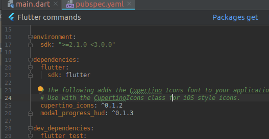
dependencies:
  modal_progress_hud: ^0.1.3
Then, just click on Package Get
The above library of flutter circular progress indicator dependencies library version may update so to get latest version visit official site here.
Now you can use them by importing wherever required.
Importing the flutter progress indicator package wherever required
Now in your Dart code (main.dart), you can use:
import 'package:modal_progress_hud/modal_progress_hud.dart';
After importing the library in the required flutter page (main.dart)
Now, all you have to do is simply wrap your widget as a child of ModalProgressHUD, typically a form, together with a boolean that is maintained in local state.
Snippet Example Code
class _MyHomePage2State extends State<MyHomePage2> {
   bool show=false;
  @override
  Widget build(BuildContext context) {
    return Scaffold(
      appBar: AppBar(
        title: Text("Progress Indicator Example"),
      ),
      body: ModalProgressHUD(
        inAsyncCall: show, // here show is bool value, which is used to when to show the progess indicator
        child: Column(
          children: <Widget>[
            Text(" Modal Progress Indicator ")
          ],
        ),
      ),
    );
  }
}
inAsyncCall : Accepts boolean type value, by setting this to true we can show the progress indicator in our flutter application.
The current parameters are customizable in the constructor
ModalProgressHUD(
  @required inAsyncCall: bool,
  @required child: Widget,
  opacity: double,
  color: Color,
  progressIndicator: CircularProgressIndicator,
  offset: double
  dismissible: bool,
);
Flutter Circular Progress Indicator example with Source Code
main.dart
Copy Paste the below code in main.dart file to make it work.
import 'package:flutter/material.dart';
import 'package:modal_progress_hud/modal_progress_hud.dart';

void main() => runApp(MyApp());

class MyApp extends StatelessWidget {
  // This widget is the root of your application.
  @override
  Widget build(BuildContext context) {
    return MaterialApp(
      title: 'Flutter Demo',
      theme: ThemeData(
        primarySwatch: Colors.blue,
      ),
      home: MyHomePage(),
    );
  }
}

class MyHomePage extends StatefulWidget {
  @override
  _MyHomePageState createState() => _MyHomePageState();
}

class _MyHomePageState extends State<MyHomePage> {
  bool showProgressloading = false; // set to false
  @override
  Widget build(BuildContext context) {
    return Scaffold(
      appBar: AppBar(
        title: Text("Modal Progress HUD Example"),
      ),
      body: ModalProgressHUD(
        inAsyncCall: showProgressloading, // is set to false, so then login button is pressed it gets activated.
        child: Padding(
          padding: EdgeInsets.symmetric(horizontal: 24.0),
          child: Column(
            mainAxisAlignment: MainAxisAlignment.center,
            crossAxisAlignment: CrossAxisAlignment.stretch,
            children: <Widget>[
              Center(
                child: Text(
                  "Log-In",
                  style: TextStyle(
                      fontSize: 25,
                      fontStyle: FontStyle.italic,
                      fontWeight: FontWeight.w800),
                ),
              ),
              SizedBox(
                height: 48.0,
              ),
              TextField(
                keyboardType: TextInputType.emailAddress,
                showCursor: true,
                decoration: InputDecoration(hintText: "Enter your Email"),
                onChanged: (value) {},
              ),
              SizedBox(
                height: 15.0,
              ),
              TextField(
                obscureText: true,
                showCursor: true,
                decoration: InputDecoration(hintText: "Enter your password"),
                onChanged: (value) {},
              ),
              SizedBox(
                height: 15.0,
              ),
              MaterialButton(
                elevation: 5.0,
                color: Colors.blueAccent,
                child: Text(
                  "Log-In",
                  style: TextStyle(color: Colors.white),
                ),
                onPressed: () {
                  print("Button Clicked");

                  setState(() {
                    showProgressloading = true; // then login button is pressed the circular flutter indicator will get active
                  });
                  // stop the Progress indicator after 5 seconds
                  new Future.delayed(const Duration(seconds: 5), () {
                    setState(() => showProgressloading = false);
                  });
                },
              )
            ],
          ),
        ),
      ),
    );
  }
}
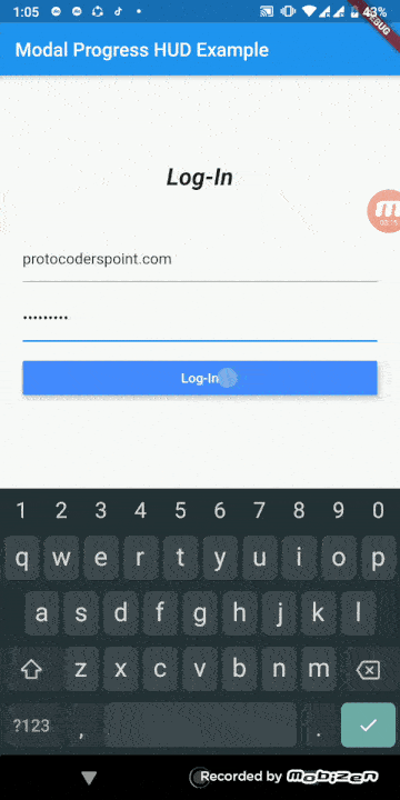
So the Source code will show a simple Login screen.
It have 2 TextField and a Button.
When the user press the login button the Flutter Circular progress indicator will be show.
- On initial load, showProgressloading is false which causes your child widget to display
- When Login button is pressed, showProgressloading is set to true, and will display the modal progress.
- Then once Futur Delayed is Completed,showProgressloading is set back to false, This will hide the progress Indicator.
and here i m making user of Future.delayed to show the progress indicator for 5 seconds.
you can just copy paste the above lines of code into your project.
")


[…] also has a Modal Progress HUD flutter library which will show registering or login wait progress indicator when button is click […]
[…] loading indicator will appear when a user will scroll descentdant is over-scrolled. An animated circular progress indicator is faded into […]
[…] above code will simply show a loading indicator for 5 seconds and then load the new […]
[…] data from server is completely loaded we will display CircularProgressIndicator() and once data is received we will show the data using ListView.builder that has Image widget to […]
[…] to Proto Coders Point, In this Flutter Tutorial we will show Toast message in flutter & show loading progress using “VELOCITY X” Library developed using Flutter SDK by Pawan […]