
")


Hi Guys, Welcome to ‘Proto Coders Point’ in this Post we will learn how to Create a Alert Dialog in Flutter app development using RFlutter_Alert Library Package.
What is Alert Dialog box?
Alert Dialog Box is basically a Box pop up which display some kind of Message or any action.It is normally used to ask the app user whether he want to continue to next process or discontinue.
Introduction to RFlutter Alert
RFlutter Alert is super customizable and easy to use alert/popup dialog for flutter app development. You may create reusuable alert styles or add buttons.
DEMO GIF
Feature of RFlutter Alert
- Can be implement Single line basic alert
- Adding buttons dynamically (as much as you want)
- Predefined beautiful alert styles (success, error, warning, info)
- Reusable alert styles
- Super customizable
- Change animation (fromTop, fromBottom, fromRight, fromLeft, grow, shrink)
- Set animation duration
- Show/hide close button
- Set overlay tap to dismiss
- Assign Title and desc styles
- Change dialog border style
Use RFlutter Alert package as a library
Step1:
Add this to your package’s pubspec.yaml file:
dependencies:
  rflutter_alert: ^1.0.3
Step 2 :
Now in your main.dart Dart code, you can use this code to import RFlutter_alert packages:
import 'package:rflutter_alert/rflutter_alert.dart';
Now you are done with importing the RFlutter Alert Library package into your Flutter Application.
Implementation of Flutter Alert dialog box
There are many ways to show a alert dialog box, but in the post will we see 4 customized way to implement Flutter Alert dialog box pop up.
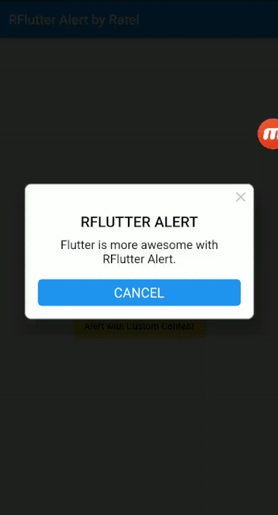
1. easiest way to create RFlutter Alert
The easiest way for creating RFlutter Alert.
This is a snippet code, Complete code for this project will be at the bottom.
Alert(
            context: context,
            title: "RFLUTTER ALERT",
            desc: "Proto Coders Point, Flutter alert dialog box is more awesome with RFlutter Alert.")
        .show();
The easiest way to display a alert dialog box in flutter is that just to display a title with some text in it and a description with some information of message.
This default alert dialog will come up a default cancel button with it to just close the dialog box.
2. Alert with a button in RFlutter Alert
Alert(
      context: context,
      type: AlertType.error,
      title: "RFLUTTER ALERT",
      desc: "Here we are creating a button inside alert box.",
      buttons: [
        DialogButton(
          child: Text(
            "Button",
            style: TextStyle(color: Colors.white, fontSize: 20),
          ),
          onPressed: () => Navigator.pop(context),
          width: 120,
        )
      ],
    ).show();
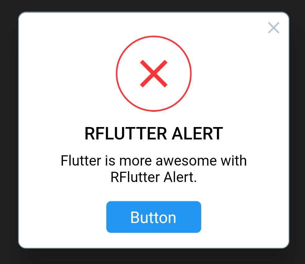
Here we are creating a button inside the alert dialog box, the button can be given some action to be performed when onclicked/onPressed.
type: AlertType.error : this will show a cross image.
3. Alert dialog with 2 Button in RFlutter Alert
Alert(
      context: context,
      type: AlertType.warning,
      title: "RFLUTTER ALERT",
      desc: "Alert Dialog with 2 Buttons.",
      buttons: [
        DialogButton(
          child: Text(
            "OK",
            style: TextStyle(color: Colors.white, fontSize: 20),
          ),
          onPressed: () => Navigator.pop(context),
          color: Color.fromRGBO(0, 179, 134, 1.0),
        ),
        DialogButton(
          child: Text(
            "Cancel",
            style: TextStyle(color: Colors.white, fontSize: 20),
          ),
          onPressed: () => Navigator.pop(context),
          gradient: LinearGradient(colors: [
            Color.fromRGBO(116, 116, 191, 1.0),
            Color.fromRGBO(52, 138, 199, 1.0)
          ]),
        )
      ],
    ).show();
Alert Dialog with 2 Buttons, Here i have created a dialog with 2 button in it. One button is to accept the alert and second button is to decline the alert message.
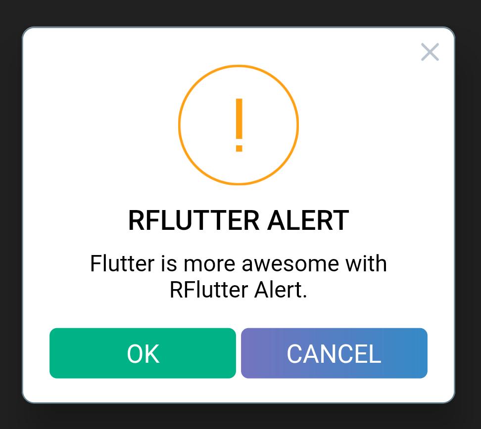
Then, i have also customized the button with gradient color feature.
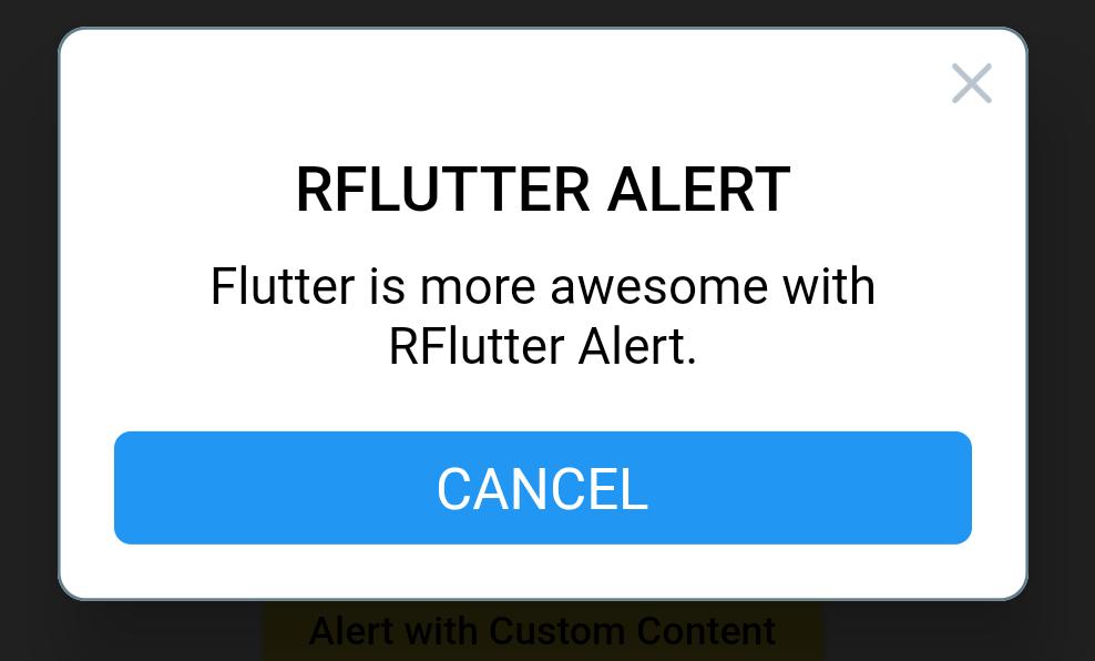
3. Alert dialog with Login Content in RFlutter Alert
Alert(
        context: context,
        title: "LOGIN",
        content: Column(
          children: <Widget>[
            TextField(
              decoration: InputDecoration(
                icon: Icon(Icons.account_circle),
                labelText: 'Username',
              ),
            ),
            TextField(
              obscureText: true,
              decoration: InputDecoration(
                icon: Icon(Icons.lock),
                labelText: 'Password',
              ),
            ),
          ],
        ),
        buttons: [
          DialogButton(
            onPressed: () => Navigator.pop(context),
            child: Text(
              "LOGIN",
              style: TextStyle(color: Colors.white, fontSize: 20),
            ),
          )
        ]).show();
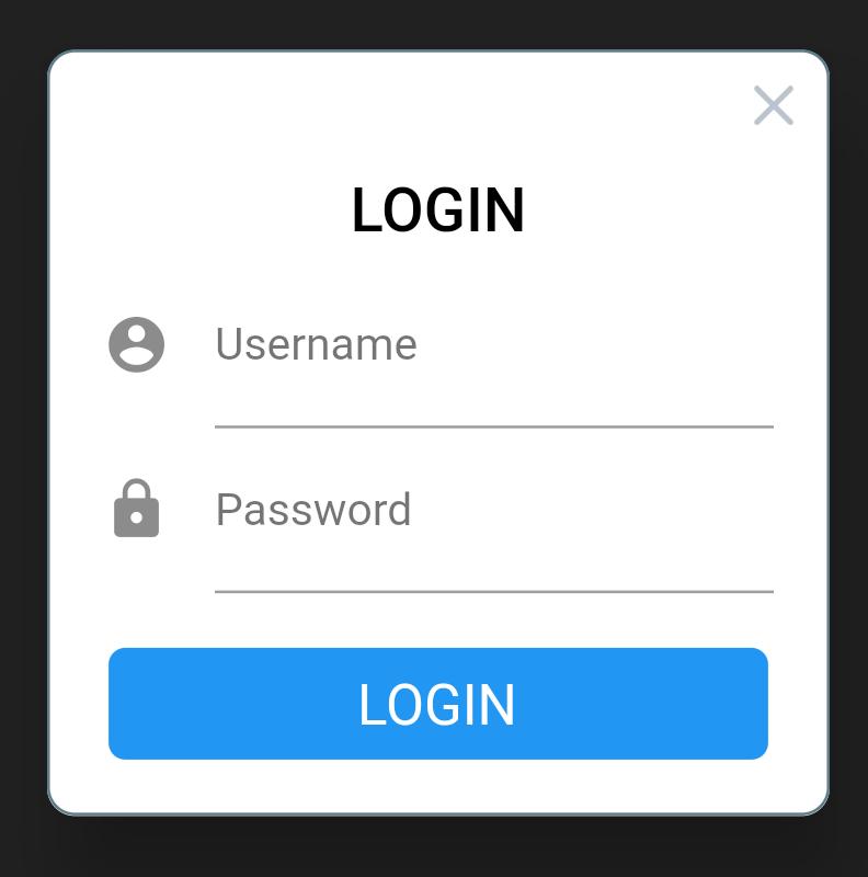
Here i have 2 TextField with a Login Button, so that we can show a login required alert dialog box
Complete Flutter Alert Dialog source code
import 'package:flutter/material.dart';
import 'package:rflutter_alert/rflutter_alert.dart';

void main() => runApp(RatelApp());

class RatelApp extends StatelessWidget {
  @override
  Widget build(BuildContext context) {
    return MaterialApp(
      debugShowCheckedModeBanner: false,
      home: Scaffold(
        appBar: AppBar(
          title: Text('RFlutter Alert by Ratel'),
        ),
        body: PopupDialog(),
      ),
    );
  }
}

class PopupDialog extends StatelessWidget {
  @override
  Widget build(BuildContext context) {
    return Container(
      child: Center(
        child: Column(
          mainAxisAlignment: MainAxisAlignment.center,
          children: <Widget>[
            RaisedButton(
              child: Text('Basic Alert'),
              onPressed: () => _onBasicAlertPressed(context),
              color: Colors.blue,
              textColor: Colors.white,
            ),
            RaisedButton(
              child: Text('Alert with Button'),
              onPressed: () => _onAlertButtonPressed(context),
              color: Colors.green,
              textColor: Colors.white,
            ),
            RaisedButton(
              child: Text('Alert with Buttons'),
              onPressed: () => _onAlertButtonsPressed(context),
              color: Colors.red,
              textColor: Colors.white,
            ),
            RaisedButton(
              child: Text('Alert with Custom Content'),
              onPressed: () => _onAlertWithCustomContentPressed(context),
              color: Colors.yellow,
              textColor: Colors.black,
            ),
          ],
        ),
      ),
    );
  }

// The easiest way for creating RFlutter Alert
  _onBasicAlertPressed(context) {
    Alert(
            context: context,
            title: "RFLUTTER ALERT",
            desc: "Flutter is more awesome with RFlutter Alert.")
        .show();
  }

// Alert with single button.
  _onAlertButtonPressed(context) {
    Alert(
      context: context,
      type: AlertType.error,
      title: "RFLUTTER ALERT",
      desc: "Flutter is more awesome with RFlutter Alert.",
      buttons: [
        DialogButton(
          child: Text(
            "Button",
            style: TextStyle(color: Colors.white, fontSize: 20),
          ),
          onPressed: () => Navigator.pop(context),
          width: 120,
        )
      ],
    ).show();
  }

// Alert with multiple and custom buttons
  _onAlertButtonsPressed(context) {
    Alert(
      context: context,
      type: AlertType.warning,
      title: "RFLUTTER ALERT",
      desc: "Flutter is more awesome with RFlutter Alert.",
      buttons: [
        DialogButton(
          child: Text(
            "Button_1",
            style: TextStyle(color: Colors.white, fontSize: 20),
          ),
          onPressed: () => Navigator.pop(context),
          color: Color.fromRGBO(0, 179, 134, 1.0),
        ),
        DialogButton(
          child: Text(
            "Button_2",
            style: TextStyle(color: Colors.white, fontSize: 20),
          ),
          onPressed: () => Navigator.pop(context),
          gradient: LinearGradient(colors: [
            Color.fromRGBO(116, 116, 191, 1.0),
            Color.fromRGBO(52, 138, 199, 1.0)
          ]),
        )
      ],
    ).show();
  }

// Alert custom content
  _onAlertWithCustomContentPressed(context) {
    Alert(
        context: context,
        title: "LOGIN",
        content: Column(
          children: <Widget>[
            TextField(
              decoration: InputDecoration(
                icon: Icon(Icons.account_circle),
                labelText: 'Username',
              ),
            ),
            TextField(
              obscureText: true,
              decoration: InputDecoration(
                icon: Icon(Icons.lock),
                labelText: 'Password',
              ),
            ),
          ],
        ),
        buttons: [
          DialogButton(
            onPressed: () => Navigator.pop(context),
            child: Text(
              "LOGIN",
              style: TextStyle(color: Colors.white, fontSize: 20),
            ),
          )
        ]).show();
  }
}
Recommended Articles
Flutter show alert dialog using quickalert package
Flutter Alert Dialog using RFlutter_alert package
Android Alert Box with list of menu options
Flutter rating dialog – redirect user to app store


