
Hi Guy’s Welcome to Proto Coders Point. In this flutter tutorial let’s learn how to show alert dialog in flutter the quickest way by using QuickAlert dialog package.
Flutter quickalert
In flutter, If you are willing to show a Alert dialog then quickalert package is the best library to use. It’s an animated alert dialog using which we can show dialop popup alert like success alert, error alert, warning alert, confirm alert dialog box with just few lines of code.
Getting Started with Installation of flutter package
1. Add Dependencies
In your flutter project, Open pubspec.yaml file & under dependencies section add quickalert flutter package.
dependencies:
  flutter:
    sdk: flutter
  quickalert:   // add this line
Now hit pub get button or run flutter pub get command to download the flutter package as external library.
2. To use it Import quickalert.dart
import 'package:quickalert/quickalert.dart';
3. Syntax to Show Alert Dialog using quickalert
To display alert all you need to do is call QuickAlert.show() widget & define a alert type property to it.
Syntax
QuickAlert.show(
          context: context,
          type: QuickAlertType.success,
          text: 'Transaction Completed Successfully!',
          autoCloseDuration: const Duration(seconds: 2),
  );
When a button is clicked or any event or action occurs from user end, you need to just call above code.
Type of Flutter Alert Dialog
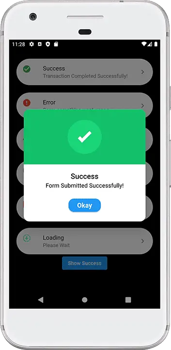
Success Alert
QuickAlert.show(
   context: context,
   type: QuickAlertType.success,
   text: 'Form Submitted Successfully!',
);
Confirm Alert
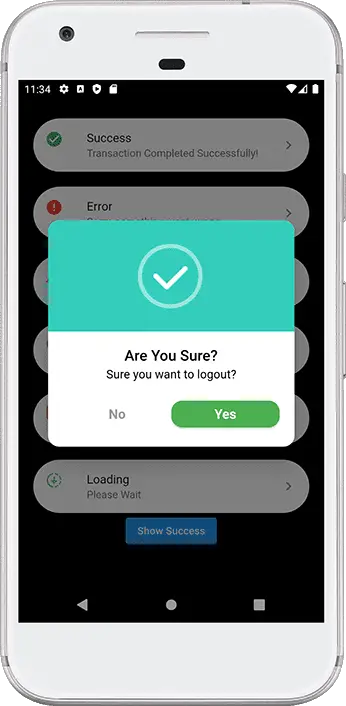
QuickAlert.show(
   context: context,
   type: QuickAlertType.confirm,
   text: 'Sure you want to logout?',
   confirmBtnText: 'Yes',
   cancelBtnText: 'No',
   confirmBtnColor: Colors.green,
  );
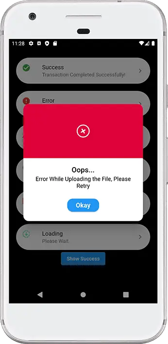
Error Alert
QuickAlert.show(
   context: context,
   type: QuickAlertType.error,
   title: 'Oops...',
   text: 'Error While Uploading the File, Please Retry ',
);
Warning Alert
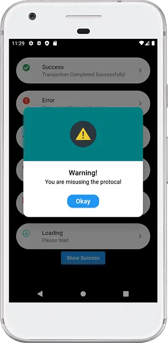
QuickAlert.show(
   context: context,
   type: QuickAlertType.warning,
   title: 'Warning!',
   text: 'You are misusing the protocal',
  );
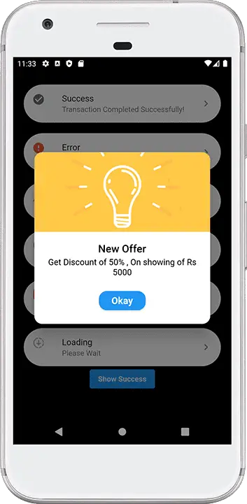
Info Alert
 QuickAlert.show(
   context: context,
   type: QuickAlertType.info,
   title: 'New Offer',
   text: 'Get Discount of 50% , On showing of Rs 5000',
  );
Loading Alert
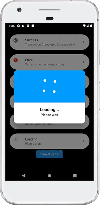
QuickAlert.show(
   context: context,
   type: QuickAlertType.loading,
   title: 'Loading...',
   text: 'Please wait',
  );
Complete Source Code – QuickAlert Example
import 'package:flutter/material.dart';
import 'package:quickalert/quickalert.dart';

void main() {
  runApp(const MyApp());
}

class MyApp extends StatelessWidget {
  const MyApp({super.key});

  // This widget is the root of your application.
  @override
  Widget build(BuildContext context) {
    return MaterialApp(
      title: 'Flutter Demo',
      debugShowCheckedModeBanner: false,
      theme: ThemeData(
        primarySwatch: Colors.blue,
      ),
      home: const MyHomePage(),
    );
  }
}

class MyHomePage extends StatefulWidget {
  const MyHomePage({Key? key}) : super(key: key);

  @override
  State<MyHomePage> createState() => _MyHomePageState();
}

class _MyHomePageState extends State<MyHomePage> {
  @override
  Widget build(BuildContext context) {
    // success Alert
    final successAlert = buildButton(
      onTap: () {
        QuickAlert.show(
          context: context,
          type: QuickAlertType.success,
          text: 'Form Submitted Successfully!',
        );
      },
      title: 'Success',
      text: 'Transaction Completed Successfully!',
      leadingIcon: Icon(
        Icons.check_circle,
        color: Colors.green,
      ),
    );

    // error Alert
    final errorAlert = buildButton(
      onTap: () {
        QuickAlert.show(
          context: context,
          type: QuickAlertType.error,
          title: 'Oops...',
          text: 'Error While Uploading the File, Please Retry ',
        );
      },
      title: 'Error',
      text: 'Sorry, something went wrong',
      leadingIcon: Icon(
        Icons.error,
        color: Colors.red,
      ),
    );
    // warning Alert
    final warningAlert = buildButton(
      onTap: () {
        QuickAlert.show(
          context: context,
          type: QuickAlertType.warning,
          title: 'Warning!',
          text: 'You are misusing the protocal',
        );
      },
      title: 'Warning',
      text: 'You just broke protocol',
      leadingIcon: Icon(
        Icons.warning,
        color: Colors.red,
      ),
    );

    // info Alert
    final infoAlert = buildButton(
      onTap: () {
        QuickAlert.show(
          context: context,
          type: QuickAlertType.info,
          title: 'New Offer',
          text: 'Get Discount of 50% , On showing of Rs 5000',
        );
      },
      title: 'Info',
      text: 'Learn More..!',
      leadingIcon: Icon(
        Icons.info,
        color: Colors.grey,
      ),
    );

    // confirm Alert
    final confirmAlert = buildButton(
      onTap: () {
        QuickAlert.show(
          context: context,
          type: QuickAlertType.confirm,
          text: 'Sure you want to logout?',
          confirmBtnText: 'Yes',
          cancelBtnText: 'No',
          confirmBtnColor: Colors.green,
        );
      },
      title: 'Confirm',
      text: 'Do you want to logout',
      leadingIcon: Icon(
        Icons.logout,
        color: Colors.orange,
      ),
    );

    // loading
    final loadingAlert = buildButton(
      onTap: () {
        QuickAlert.show(
          context: context,
          type: QuickAlertType.loading,
          title: 'Loading...',
          text: 'Please wait',
        );
      },
      title: 'Loading',
      text: 'Please Wait',
      leadingIcon: Icon(
        Icons.downloading,
        color: Colors.greenAccent,
      ),
    );

    return Scaffold(
      backgroundColor: Colors.black54,
      body: Center(
        child: Column(
          mainAxisAlignment: MainAxisAlignment.center,
          children: [
            successAlert,
            SizedBox(
              height: 20,
            ),
            errorAlert,
            SizedBox(
              height: 20,
            ),
            warningAlert,
            SizedBox(
              height: 20,
            ),
            infoAlert,
            SizedBox(
              height: 20,
            ),
            confirmAlert,
            SizedBox(
              height: 20,
            ),
            loadingAlert,
            ElevatedButton(
                onPressed: () {
                  QuickAlert.show(
                      context: context,
                      type: QuickAlertType.success,
                      title: "The Action was Successful",
                      text: "Subscribe to Proto Coders Point",
                      textColor: Colors.red,
                      autoCloseDuration: Duration(seconds: 2));
                },
                child: Text("Show Success"))
          ],
        ),
      ),
    );
  }
}

// flutter custom card button
Card buildButton({
  required onTap,
  required title,
  required text,
  required leadingIcon,
}) {
  return Card(
    shape: const StadiumBorder(),
    margin: const EdgeInsets.symmetric(
      horizontal: 20,
    ),
    clipBehavior: Clip.antiAlias,
    elevation: 1,
    child: ListTile(
      onTap: onTap,
      leading: leadingIcon,
      title: Text(title ?? ""),
      subtitle: Text(text ?? ""),
      trailing: const Icon(
        Icons.keyboard_arrow_right_rounded,
      ),
    ),
  );
}
Recommended Articles
Flutter Alert Dialog using RFlutter_alert package
Android Alert Box with list of menu options
Flutter rating dialog – redirect user to app store
")


