ASCII stands for “American Standart code for informaton exchange”. Is used for character encoding standard for electronic communication.
In simple words ASCII is a technique used to get ASCII number of a character.
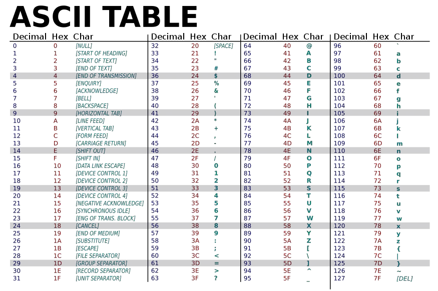
Here is a ASCII value chart for you for reference.
Eg: Suppose you want ascii value of character capital ‘R’, you can check above ascii chart we have R = 82, like wise for small letter ‘r’ = 114.
Ascii in dart – code unit in dart
In dart language, ascii is also know as code unit. In dart, each character is in UTF-16 form.
dart String class we have 2 methods to get code unit of a given character or also loop to string character to get all code units by each index of string value.
Dart codeUnitAt(index) & codeUnits methods
As i said above, String class in dart has 2 main method that can be used to convert string to ASCII in dart.
1. string.codeUnitAt(index)
The codeUnitAt method is used to get ascii/code unit of character in string using it’s index value.
int codeUnitAt(int index)
It accepts a integer parameter (i.e. index) and return a integer value of ASCII code.
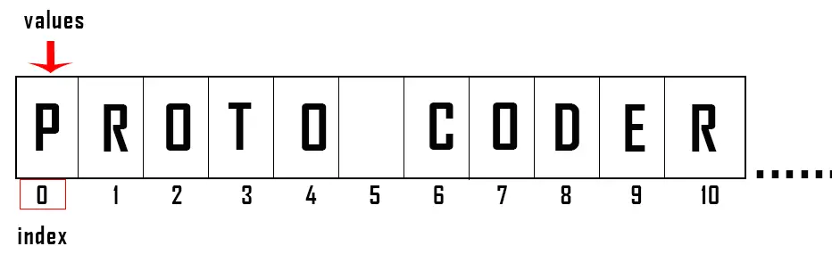
As you all know that index value starts from ‘0’. i.e. 0 index is the first character of a string, 1 is second character of a string and so on. Have a look to example.
String name = "PROTO CODERS POINT";
so if you want to convert index 0 position from string, then you can simple do it by:-
name.codeUnitAt(0); // here 0 is index value.
1. Dart code for converting character to ascii value
import 'dart:io';
void main() {
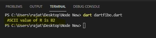
String ch = 'R';
print(' ASCII value of ${ch[0]} is ${ch.codeUnitAt(0)}');
}
output
character to ascii in dart
2. Looping through all character in string.
import 'dart:io';
void main() {
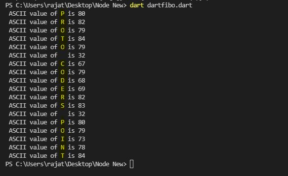
String name = 'PROTO CODERS POINT';
//loop to each character in string
for(int i = 0; i <name.length; i++){
print(' ASCII value of ${name[i]} is ${name.codeUnitAt(i)}');
}
}
Output
2. string.codeUnits
The string.codeUnits is used to get all the ascii value / code units of a given string & it returns code unit(ascii value) in list.
defined as:
List codeUnits
To get list of code unit(ascii value) of a given string simply pass the string to this method.
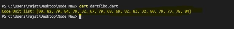
Eg: String name =''RAJAT";
       print("ASCII list of given string  ${name.codeUnits}.
import 'dart:io';

void main() {

 String name = 'PROTO CODERS POINT';

 //returns list of code unit value.
 print('Code Unit list: ${name.codeUnits}');

}
In mathematic, the fibonacci series, is denoted by Fn. Here, the next number will be the sum of previous two numbers.
Initial starting two numbers will be 0 & 1, denoted by F0 = 0, F1 = 1;
Simple mathematical formula to get Fn ‘ the next number’..
Fn = F(n-1) +F(n-2)
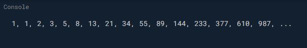
Therefore, the fib sequence looks like this:-
0, 1, 1, 2, 3, 5, 8, 13, 21, 34, 55, 89, 144, ........ and so on up to Nth
How is fibonacci numbers generated?
Initially we have starting number which always start with 0 & 1 i.e F0 = 0, F1 = 1;
Now we perform sum of F0 + F1 = Fn.
i.e. F2 = F0 + F1.
Fibonacci Sequence flow animation example
Eg: initial value 0 & 1.
1st iteration: F2= F0 + F1 0 + 1 F2 = 1
2nd iteration: F3= F1 + F2 1 + 1 F3 = 2
3rd iteration: F4= F2 + F3 1 + 2 F4 = 3
4th iteration: F5= F3 + F4 2 + 3 F5 = 5
5th iteration: F6= F4 + F5 3 + 5 F6 = 8
and so on up to Nth
How to implement fibonacci in dart? Fibonacci Algorithm.
Step1: Start
Step2: Declare initial variable f0 = 0, f1 = 1,f2, n, i =1;
Step3: Read n from user, how many fibo sequence user wants to generate.
Step4: Print f0 & f1
Step5: Repeat until i < n
         5.1: f2 = f0 + f1;
         5.2: Print f2;
         5.3: inter change value f0 = f1;
                                     f1 = f2;
         5.4: i ++;
Step6: Stop.
int fibonacci(int n) => n <= 2 ? 1 : fibonacci(n - 2) + fibonacci (n - 1);

main() {
  String output = "";
  for (int i = 1; i <= 16; ++i) {
    output += fibonacci(i).toString() + ", ";
  }
  print(output + "...");
}
output
What is a real world example of the Fibonacci numbers?
One of the best & easiliest way to understand fibonacci series used in real file application is, converting mile to kilometer and kilometer to mile.
Let’s now see the Fibonacci series :
0, 1, 1, 2, 3, 5, 8, 13, 21, 34, 55, 89, 144,…
For example :
Mile to kilometer conversion : If we take a number from Fibonacci series i.e., 8 then the kilometer value will be 12.874752 by formulae, which is nearly 13 by rounding.
Kilometer to mile conversion : If we take a number from Fibonacci series i.e., 89 as kilometer value then mile value will be 55.30203610912272 by formulae, which could be considered as 55 by rounding.
Finally in both conversions, the left element will be considered as mile value and right element will be considered as Kilometer value in the Fibonacci series.
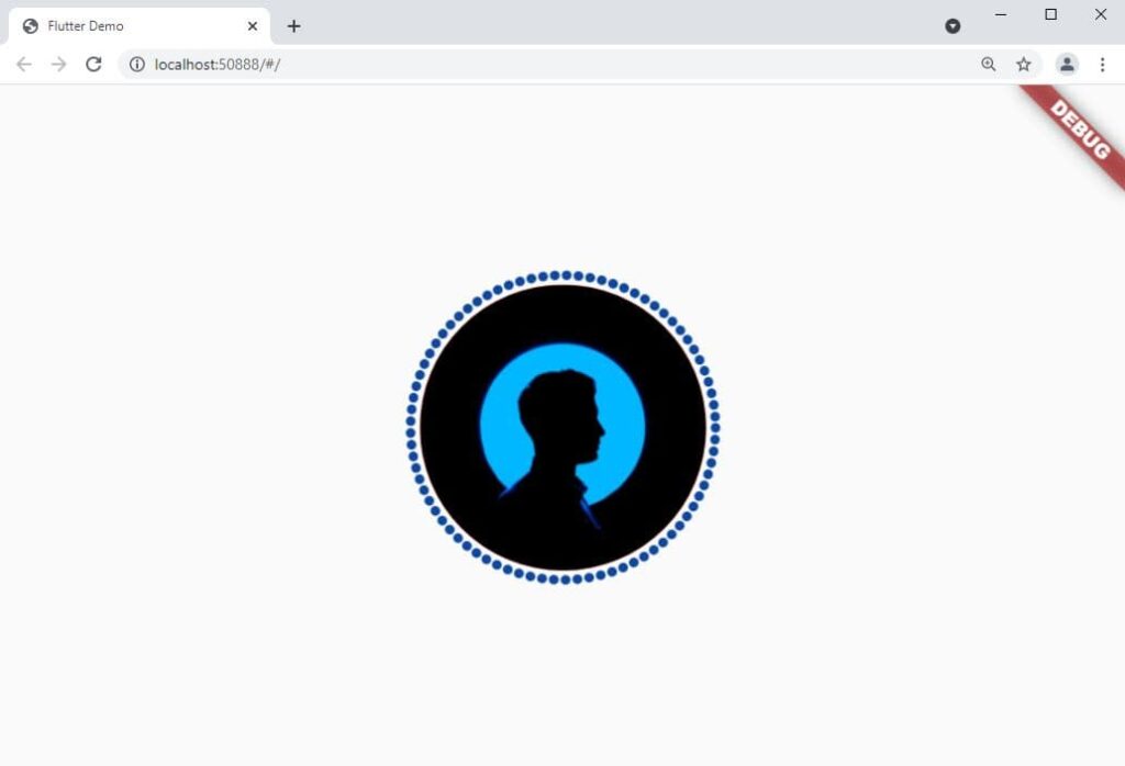
Hi Guys, Welcome to Proto Coders Point. In this flutter tutorial(Article) we will learn how to give dotted border around any widget in flutter.
Note: to add dashed border or dotted border to our widget, we will make use of “flutter_dotted_border“ package. that let’s developer to easilt implement dotted border in flutter.
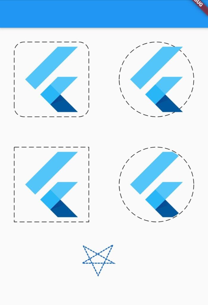
Output example
dotted border example
Video Tutorial
Installation of package
1. Run a command to install the package
flutter pub add dotted_border
In your IDE terminal type above command & enter. It will add line in pubspec.yaml file.
dependencies:
  dotted_border: ^2.0.0  #latest version
OR
Directly add it under dependencies section
Open pubspec.yaml file and under dependencies section add the border dotted library.
dependencies:
  dotted_border: ^2.0.0  #latest version
2. Import dotted_border.dart file
once you have added the package now you just need to import it wherever required.
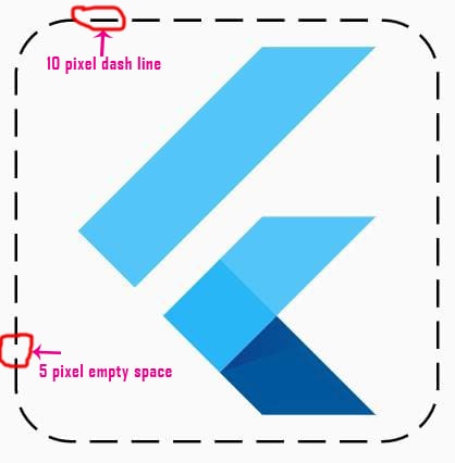
Then, if you want to customize the space between dash border, you can easily do it by property ‘dashPattern’ just specity the dash sequence by passing array list of pixel size of dash size & empty space.
Complete source code – flutter dotted border example
main.dart
In below code.
I am use GridView to build list of widget with dotted border.
firstly i have initialized 2 array list of type BorderType & and double list. In BorderType we have type such as RRect for show rounded rectangle, Rect to get simple rectangle border, circle to show fully rounded border and Oval to show oval shape in border.
Then this list is been passed through itemBuilder to create widget BuildBorderWidget.
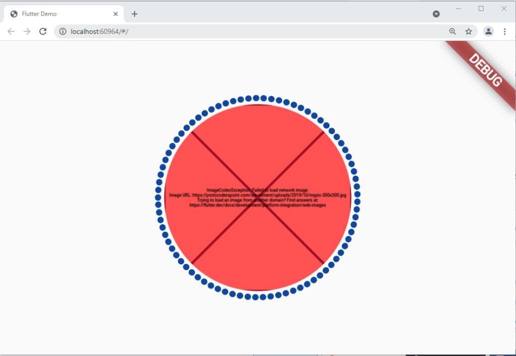
Hi Guys, Welcome to Proto Coders Point. I was working with one of my flutter project, the app is working perfectly in android & iOS mobile but when i run the flutter web project in browser. The Image i want to load from Network is not loading and in console it’s showing the error “Failed to load network image” flutter web.
======== Exception caught by image resource service ================================================
 The following ImageCodecException was thrown resolving an image codec:
 Failed to load network image.
 Image URL: https://protocoderspoint.com/wp-content/uploads/2019/10/mypic-300x300.jpg
 Trying to load an image from another domain? Find answers at:
Solution “Failed to load network image”
Flutter user two type of renderer for web app, canvakit & html.
when you run/build app on flutter web it uses renderer based on the device the app is run.
Flutter HTML renderer: when app it run on mobile devices.
Flutter Canvakit renderer: when the app is run on desktop browser – flutter web.
The HTML renderer can load cross-origin image, there is not need to add any extra configuration.
Run below command to solve ‘failed to load Network image’ in flutter web
Hi Guys, Welcome to Proto Coder Point. In this flutter tutorial article, we will learn a simplest way to implement drag & drop feature in flutter web, By using which, a user can easily drop to upload a file such as images, video, document etc in to flutter dropzone.
Note: To add drop & dropzone in our flutter web app we will make use of ‘flutter_dropzone‘ package.
Video Tutorial
Complete Code is Below & Output 👇👇👇👇
Introduction to flutter dropzone package
A dropzone in flutter is a plugin, flutter for web only, by using which a developer can easily add drag & drop zone feature in flutter app.
A user can easily make use of this feature to drop a file or pickFile from brower file picker window.
Important Note: This package is only for flutter web app. As you all know that drop drop can’t be done in mobile devices.
So let’s quickly start adding this package in our flutter project.
Implementing Flutter drag and drop in flutter web app
1. Create or Open a flutter project
Onen your favorite IDE, My favorite IDE is Android-Studio to build flutter application.
goto > File > New > New Flutter Project ( Give good name to project > Next & Done)
your project will get created.
To open existing flutter project
goto > File > open ( select the project and open )
2. Add flutter_dropzone dependenies
Now, open pubspec.yaml file & under dependencies section add dropzone package.
dependencies:
  flutter_dropzone: ^2.0.1
3. Import flutter_dropzone.dart
Then, once you have added the dependencies in your project as a external libraries, to use it you need to import wherever you want to add dropzone.
This library has a file picking functionality, controller should be used to pick a file from browser, when a choose file button is clicked.
late DropzoneViewController controller;
pickFiles() method simply load & open, choose file dialog window in your browser that lets users to pick file.
final events = await controller.pickFiles();
snippet of button event that loads pickFile() method.
ElevatedButton.icon(
    onPressed: () async {
              // this will open a diglog in browser to pick a file..
               final events = await controller.pickFiles();
               if(events.isEmpty) return;
             // the user selected file detail is stored in event dynamic datatype and passed through method.
               UploadedFile(events.first);
    },
    icon: Icon(Icons.search),
    label: Text(
               'Choose File',
               style: TextStyle(color: Colors.white, fontSize: 15),
    ),
style: ElevatedButton.styleFrom(
          padding: EdgeInsets.symmetric(
          horizontal: 20
  ),
  primary: highlight? Colors.blue: Colors.green.shade300,
  shape: RoundedRectangleBorder()
),
)
Now all the data detail of pickedFile is stored in ‘events’ object, so to extract picked File information dropzoneViewController object is used, as shown below.
final name = event.name;
final mime = await controller.getFileMIME(event);
final byte = await controller.getFileSize(event);
final url = await controller.createFileUrl(event);
Complete source code of flutter drag and drop Github
you can simple clone the project or else refer below step by step process to implement drag drop area in flutter web.
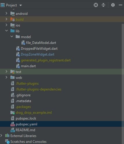
Check out my flutter project files structure for easy understanding.
In your Project > lib folder
create a new dart class file for handling Data by name file data model.
1. File_Data_Model.dart
class File_Data_Model{
  final String name;
  final String mime;
  final int bytes;
  final String url;

  File_Data_Model({required this.name,required this.mime,required this.bytes, required this.url});

  String get size{
    final kb = bytes / 1024;
    final mb = kb / 1024;

    return mb > 1 ? '${mb.toStringAsFixed(2)} MB' : '${kb.toStringAsFixed(2)} KB';
  }

}
This data model class is used to hold the data of the file dropped or picked by the user. This file holds 4 datatype value such as name of file, mime type of file, int byte size of file and the URL path of the selected file.
It also has a getter method that convert bytes to MB or KB & return the size of file to user UI.
main.dart
import 'package:drag_drop_example/DropZoneWidget.dart';
import 'package:drag_drop_example/DroppedFileWidget.dart';
import 'package:drag_drop_example/model/file_DataModel.dart';
import 'package:flutter/material.dart';
import 'package:flutter_dropzone/flutter_dropzone.dart';

void main() {
  runApp(MyApp());
}

class MyApp extends StatelessWidget {
  // This widget is the root of your application.
  @override
  Widget build(BuildContext context) {
    return MaterialApp(
      debugShowCheckedModeBanner: false,
      title: 'Flutter Demo',
      theme: ThemeData(

        primarySwatch: Colors.blue,
      ),
      home: MyHomePage()
    );
  }
}

class MyHomePage extends StatefulWidget {


  @override
  _MyHomePageState createState() => _MyHomePageState();
}

class _MyHomePageState extends State<MyHomePage> {
  //object of datamodel class
  File_Data_Model? file;
  @override
  Widget build(BuildContext context) {
    return Scaffold(
      appBar: AppBar(
        title: Text("drag drop flutter Web"),
      ),
      body: SingleChildScrollView(
        child: Container(
            alignment: Alignment.center,
            padding: EdgeInsets.all(15),
            child: Column(
              children: [
                // here DropZoneWidget is statefull widget file
                Container(
                  height: 300,
                  child: DropZoneWidget(
                    onDroppedFile: (file) => setState(()=> this.file = file) ,
                  ),
                ),
                SizedBox(height: 20,),
                // DroppedFileWidget is self designed stateless widget to displayed user dropped image file as preview with detail info
                DroppedFileWidget(file:file ),

              ],
            )),
      ),
    );
  }
}
In above code, we have a Column widget which has 3 children widget.
DropZoneWidget.dart
Now Create a new dart file by name DropZoneWidget.dart in lib directory as shown in above project structure.
import 'package:drag_drop_example/model/file_DataModel.dart';
import 'package:flutter/cupertino.dart';
import 'package:flutter/material.dart';
import 'package:flutter_dropzone/flutter_dropzone.dart';
import 'package:dotted_border/dotted_border.dart';

class DropZoneWidget extends StatefulWidget {

  final ValueChanged<File_Data_Model> onDroppedFile;

  const DropZoneWidget({Key? key,required this.onDroppedFile}):super(key: key);
  @override
  _DropZoneWidgetState createState() => _DropZoneWidgetState();
}

class _DropZoneWidgetState extends State<DropZoneWidget> {
  //controller to hold data of file dropped by user
  late DropzoneViewController controller;
  // a variable just to update UI color when user hover or leave the drop zone
  bool highlight = false;

  @override
  Widget build(BuildContext context) {

    return buildDecoration(

        child: Stack(
          children: [
            // dropzone area
            DropzoneView(
                // attach an configure the controller
                onCreated: (controller) => this.controller = controller,
                // call UploadedFile method when user drop the file
                onDrop: UploadedFile,
                // change UI when user hover file on dropzone
                onHover:() => setState(()=> highlight = true),
                onLeave: ()=> setState(()=>highlight = false),
                onLoaded: ()=> print('Zone Loaded'),
                onError: (err)=> print('run when error found : $err'),
            ),

            Center(
              child: Column(
                mainAxisAlignment: MainAxisAlignment.center,
                children: [
                  Icon(
                    Icons.cloud_upload_outlined,
                    size: 80,
                    color: Colors.white,
                  ),
                  Text(
                    'Drop Files Here',
                    style: TextStyle(color: Colors.white, fontSize: 24),
                  ),
                  const SizedBox(
                    height: 16,
                  ),
                  // a button to pickfile from computer
                  ElevatedButton.icon(
                      onPressed: () async {
                        final events = await controller.pickFiles();
                        if(events.isEmpty) return;
                        UploadedFile(events.first);
                      },
                      icon: Icon(Icons.search),
                      label: Text(
                        'Choose File',
                        style: TextStyle(color: Colors.white, fontSize: 15),
                      ),
                  style: ElevatedButton.styleFrom(
                    padding: EdgeInsets.symmetric(
                      horizontal: 20
                    ),
                    primary: highlight? Colors.blue: Colors.green.shade300,
                    shape: RoundedRectangleBorder()
                  ),
                  )
                ],
              ),
            ),
          ],
        ));
  }

  Future UploadedFile(dynamic event) async {
    // this method is called when user drop the file in drop area in flutter

    final name = event.name;
    final mime = await controller.getFileMIME(event);
    final byte = await controller.getFileSize(event);
    final url = await controller.createFileUrl(event);

    print('Name : $name');
    print('Mime: $mime');

    print('Size : ${byte / (1024 * 1024)}');
    print('URL: $url');

     // update the data model with recent file uploaded
    final droppedFile = File_Data_Model
      (name: name, mime: mime, bytes: byte, url: url);

    //Update the UI
    widget.onDroppedFile(droppedFile);
    setState(() {
      highlight = false;
    });
  }

  Widget buildDecoration({required Widget child}){
    final colorBackground =  highlight? Colors.blue: Colors.green;
    return ClipRRect(
      borderRadius: BorderRadius.circular(12),
      child: Container(
        padding: EdgeInsets.all(10),
        child: DottedBorder(
          borderType: BorderType.RRect,
            color: Colors.white,
            strokeWidth: 3,
            dashPattern: [8,4],
            radius: Radius.circular(10),
            padding: EdgeInsets.zero,
            child: child
        ),
        color: colorBackground,
      ),
    );
  }
}
DroppedFileWidget.dart
import 'package:flutter/cupertino.dart';
import 'package:flutter/material.dart';
import 'package:drag_drop_example/model/file_DataModel.dart';

class DroppedFileWidget extends StatelessWidget {

  // here we get the uploaded file data
  final File_Data_Model? file;
  const DroppedFileWidget({Key? key, required this.file}) : super(key: key);

  @override
  Widget build(BuildContext context) {

  return Row(
    mainAxisAlignment: MainAxisAlignment.center,
    children: [
      Expanded(child: buildImage(context)),
    ],
  );
  }

  // a custom widget to show image
  Widget buildImage(BuildContext context){
    // will show no file selected when app is open for first time.
    if (file == null) return buildEmptyFile('No Selected File');

    return Column(
      children: [
        if(file != null) buildFileDetail(file),
        // if file dropped is Image then display image from data model URL variable
        Image.network(file!.url,
          width: MediaQuery.of(context).size.width ,
          height: MediaQuery.of(context).size.height,
          fit: BoxFit.cover,
          // if displaying image failed, that means there is not preview so display no preview
          errorBuilder:(context,error,_)=>buildEmptyFile('No Preview'),
        ),
      ],
    );
  }

  //custom widget to show no file selected yet
  Widget buildEmptyFile(String text){
     return Container(
       width: 120,
       height: 120,
       color: Colors.blue.shade300,
       child: Center(child: Text(text)),
     );
  }


  //a custom widget to show uploaded file details to user

  Widget buildFileDetail(File_Data_Model? file) {
    final style = TextStyle( fontSize: 20);
    return Container(
       margin: EdgeInsets.only(left: 24),
       child: Column(
         mainAxisAlignment: MainAxisAlignment.start,
         children: [
           Text('Selected File Preview ',style: TextStyle(fontWeight: FontWeight.w500,fontSize: 20),),
           Text('Name: ${file?.name}',style: TextStyle(fontWeight: FontWeight.w800,fontSize: 22),),
           const SizedBox(height: 10,),
           Text('Type: ${file?.mime}',style: style),
           const SizedBox(height: 10,),
           Text('Size: ${file?.size}',style: style),
           SizedBox(height: 20,)
         ],
       ),
    );
  }
}
Hi Guys, Welcome to Proto Coders Point. In this flutter article we will learn about flutter switch button & how to keep it on/off when user close the app, re-visit the app & switch button will be in same state as it was before user leave the app.
Note: To achieve this we will make use of 2 packages.
Flutter switch button example – by using GetX State Management
Check out both the video to implement in your project while watching video.
Add dependencies get & getstorage
In your flutter project open pubspec.yaml then under dependencies add it.
dependencies:

  get: ^4.1.4
  get_storage: ^2.0.2
Get: Also called as GetX, used for many operation such as route management, state management, navigating pages, email validation, GetXStorage, show snackbar, show alert dialog and more. In our project we will just use getx state management to update the widget state without refreshing complete widget tree just to update 1 widget.
GetStorage: A Flutter GetXStoarge is an alternative of sharedPreferences which help you to store app data in memery that a user perform. In our project we will store weather the user has turned ON switch or OFF switch before leaving the app, and when he return to app the switch button in flutter will be in same state as it was before user leave the app.
Note: To use getstorage u must also add getX dependencies else getStorage will return you error.
Complete source code below
Flutter Switch example – using default setState() method to update UI & store switch on/off data using getStorage
Flutter Switch button Example using getx state management & store on/off data of switch using getstorage
Create new dart File by name ‘GetXSwitchState’ or any name as you want
[project] > lib (right click) > New > Dart File
GetXSwitchState.dart
import 'package:get/get.dart';
import 'package:get_storage/get_storage.dart';


class GetXSwitchState extends GetxController{

  // a variable to On Off Switch in flutter
  var isSwitcheded = false;

  // instance of GetStorage, to store data in key value pair.
  final switchdatacontroller = GetStorage();

  GetXSwitchState(){
    print("Constructor called");
    // when user re-visit app, we check previous state of app weather it was on or off.
    if(switchdatacontroller.read('getXIsSwitched') != null){
      isSwitcheded = switchdatacontroller.read('getXIsSwitched');
      update();
    }
  }
  // called when user click on switch to on/off it
  changeSwitchState(bool value){

    isSwitcheded = value;

     // store data in getstorage true or false
     //here in key 'getXIsSwitched' we store bool type either true or else
     // if true then switch is ON else OFF
    switchdatacontroller.write('getXIsSwitched', isSwitcheded);

    // update the UI
    update();
  }
}
main.dart
import 'package:flutter/material.dart';
import 'package:flutter_getx_storage/GetXSwitchState.dart';
import 'package:get/get.dart';
import 'package:get_storage/get_storage.dart';

void main() async {
  await GetStorage.init();
  runApp(MyApp());
}

class MyApp extends StatelessWidget {
  // This widget is the root of your application.
  @override
  Widget build(BuildContext context) {
    return GetMaterialApp(
      title: 'Flutter Demo',
      theme: ThemeData(
        primarySwatch: Colors.blue,
      ),
      home: MyHomePage(),
    );
  }
}

class MyHomePage extends StatefulWidget {
  @override
  _MyHomePageState createState() => _MyHomePageState();
}

class _MyHomePageState extends State<MyHomePage> {
     // Create a instance of GetXSwitchState class
   final GetXSwitchState getXSwitchState = Get.put(GetXSwitchState());

  @override
  Widget build(BuildContext context) {
    return Scaffold(
      body: Center(
        child: Column(
          mainAxisAlignment: MainAxisAlignment.center,
          children: [
            Text(" Getx State Management Switch"),
            // we are wraping the switch with GetBuilder so that it keep observing any change need to be done
            GetBuilder<GetXSwitchState>(builder: (_) => Switch
              (value: getXSwitchState.isSwitcheded,
                onChanged: (value){
                   getXSwitchState.changeSwitchState(value);
                }))

          ],
        ),
      ) ,
    );
  }
}
In above code, we have create a instance object of GetXSwitchState, that will used to get data from it. Then we are wraping the switch with GetBuilder so that it keep observing any change need to be done & update the UI as per user action.


