
Hi Guys, Welcome to Proto Coders Point.
In this Flutter tutorial, we will create custom appbar in flutter.
Building a beautiful custom appbar will Enhance the UI look of a flutter app. Flutter allows us to build a awesome & Interactive application by which a business can Grab it’s customer atttention.
In this tutorial, We will create 2 designs of a appbar in flutter.
- Flutter AppBar with border radius.
- Curved Button shape Appbar using ClipPath with CustomClipper<Path>.
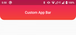
1. Flutter Appbar with Gradient Color, Border Radius – How to Give Rounded Border to AppBar
Video Tutorial
Inside AppBar Widget we have a property called as ‘flexiableSpace’, by using flexiableSpace, We can add any widget inside appbar, so let’s add a container into it.
Let’s Create a custom appbar, As you can see in above Appbar UI design, it has a Gradient background color & it also has a border radius.
Snippet Code
flexibleSpace: Container(
            decoration: BoxDecoration(
                borderRadius: BorderRadius.only(bottomLeft: Radius.circular(20),bottomRight: Radius.circular(20)),
                gradient: LinearGradient(
                    colors: [Colors.red,Colors.pink],
                    begin: Alignment.bottomCenter,
                    end: Alignment.topCenter
                )
            ),
          ),
Complete Source code – Flutter Custom AppBar with Border Raduis
main.dart
import 'package:flutter/cupertino.dart';
import 'package:flutter/material.dart';

void main() {
  runApp(MyApp());
}

class MyApp extends StatelessWidget {
  // This widget is the root of your application.
  @override
  Widget build(BuildContext context) {
    return MaterialApp(
      title: 'Flutter Demo',
      debugShowCheckedModeBanner: false,
      theme: ThemeData(
        primarySwatch: Colors.blue,
      ),
      home: MyHomePage(),
    );
  }
}

class MyHomePage extends StatefulWidget {
  const MyHomePage({Key? key}) : super(key: key);

  @override
  _MyHomePageState createState() => _MyHomePageState();
}

class _MyHomePageState extends State<MyHomePage> {
  @override
  Widget build(BuildContext context) {
    return Scaffold(
        appBar: AppBar(
          brightness: Brightness.dark,
          backgroundColor: Colors.transparent,
          elevation: 0.0,
          toolbarHeight: 70,
          title: Text("Custom App Bar"),
          centerTitle: true,
          flexibleSpace: Container(
            decoration: BoxDecoration(
                borderRadius: BorderRadius.only(bottomLeft: Radius.circular(20),bottomRight: Radius.circular(20)),
                gradient: LinearGradient(
                    colors: [Colors.red,Colors.pink],
                    begin: Alignment.bottomCenter,
                    end: Alignment.topCenter
                )
            ),
          ),
        ),
    );
  }
}
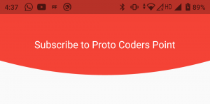
2. Curved Bottom Shape AppBar
Video Tutorial
As you can see in above Appbar UI Design, We have a AppBar that is been curved from bottom like a Rounded Circular Appbar in flutter.
To acheive curved shape in flutter we will make use of clipPath with CustomClipper, By which we can clip a Container as per our needs.
So let’s begin.
1. Create a CustomShape.dart class
Create a new dart file in lib directory by name ‘ CustomShape.dart’, THis class extends CustomClipper<Path> that we can use to clip any widget inside ClipPath Class.
CustomClipper<Path> has 2 override methods
- getClip: We can define our clipping path over here.
- shouldReclip: Re-clip the widget by using oldClipper( We are not using this, In this tutorial)
CustomShape.dart ( Code )
import 'package:flutter/cupertino.dart';
import 'package:flutter/material.dart';

class Customshape extends CustomClipper<Path>{
  @override
  Path getClip(Size size) {
    double height = size.height;
    double width = size.width;

    var path = Path();
    path.lineTo(0, height-50);
    path.quadraticBezierTo(width/2, height, width, height-50);
    path.lineTo(width, 0);
    path.close();
    return path;
  }

  @override
  bool shouldReclip(covariant CustomClipper<Path> oldClipper) {
    // TODO: implement shouldReclip
    return true;
  }

}
2. Use ClipPath to Give shape to Container
Now, Apply the CustomShape to container by using ClipPath Clipper Property.
//Snippet

ClipPath(
          clipper: Customshape(),
          child: Container(
            height: 250,
            width: MediaQuery.of(context).size.width,
            color: Colors.red,
            child: Center(child: Text("Subscribe to Proto Coders Point",style: TextStyle(fontSize: 20,color: Colors.white),)),
          ),
        ),
Complete Code – Curved Bottom Shape Flutter Appbar
import 'package:customized_appbar/customShape.dart';
import 'package:flutter/cupertino.dart';
import 'package:flutter/material.dart';

void main() {
  runApp(MyApp());
}

class MyApp extends StatelessWidget {
  // This widget is the root of your application.
  @override
  Widget build(BuildContext context) {
    return MaterialApp(
      title: 'Flutter Demo',
      debugShowCheckedModeBanner: false,
      theme: ThemeData(
        primarySwatch: Colors.blue,
      ),
      home: MyHomePage(),
    );
  }
}

class MyHomePage extends StatefulWidget {
  const MyHomePage({Key? key}) : super(key: key);

  @override
  _MyHomePageState createState() => _MyHomePageState();
}

class _MyHomePageState extends State<MyHomePage> {
  @override
  Widget build(BuildContext context) {
    return Scaffold(
      appBar:  AppBar(
        toolbarHeight: 130,
        backgroundColor: Colors.transparent,
        elevation: 0.0,
        flexibleSpace: ClipPath(
          clipper: Customshape(),
          child: Container(
            height: 250,
            width: MediaQuery.of(context).size.width,
            color: Colors.red,
            child: Center(child: Text("Subscribe to Proto Coders Point",style: TextStyle(fontSize: 20,color: Colors.white),)),
          ),
        ),
      ),
       body: Container(),
    );
  }
}
Recommended Post
Implement Dotted Border or Dashed Border to Widget
")


