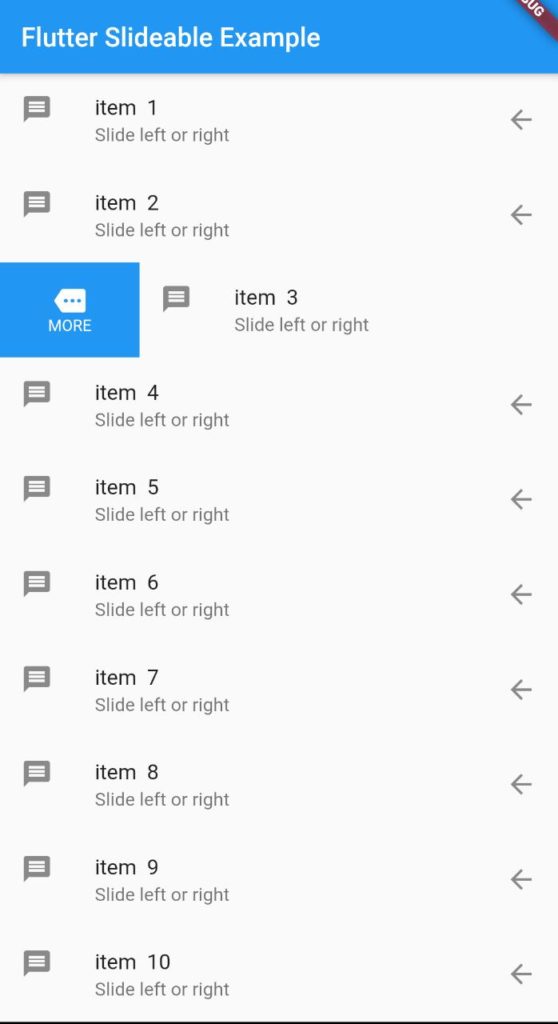
Hi Guys, Welcome to Proto Coders Point In this Flutter Tutorial we will implement Flutter Slidable action on ListView with ListTile widget.
Flutter Slidable Widget
A Flutter Slidable Widget can be applied on Flutter ListView with ListTile widget that can help developer to give left or right directional slide actions with we create a beautiful User Interface and User Experience where user this Slidable widget to dismiss any listTile he don’t want to user.
Eg: you might have used gmail mobile app which makes user of Slidable listTile where you can easily slide left or right on the email you recieved where you can take different actions like delete the mail, or mark it as important and many more actions
let’s begin implementing Flutter Slidable in our project
Adding this package in our project
To add this slidable package into our project you need to
Add this to your package’s pubspec.yaml file:
dependencies:
  flutter_slidable: ^0.5.4  // version might vary
Note : the verison might vary by time so just go to official site to get latest version of this library.
once you add the dependencies in pubspec.yaml file just click on Packages get, and then required package is been added into our flutter project.
Importing package
As you added the dependencies all the required packages will be added to your project.
All you need to do is just import the package dart file where every it’s requited.
import 'package:flutter_slidable/flutter_slidable.dart';
Snippet code of Flutter Slidable
Slidable(
  actionPane: SlidableDrawerActionPane(),
  actionExtentRatio: 0.25,
  child: Container(
    color: Colors.white,
    child: ListTile(
      leading: CircleAvatar(
        backgroundColor: Colors.indigoAccent,
        child: Text('$3'),
        foregroundColor: Colors.white,
      ),
      title: Text('Tile n°$3'),
      subtitle: Text('SlidableDrawerDelegate'),
    ),
  ),
  actions: <Widget>[
    IconSlideAction(
      caption: 'Archive',
      color: Colors.blue,
      icon: Icons.archive,
      onTap: () => _showSnackBar('Archive'),
    ),
    IconSlideAction(
      caption: 'Share',
      color: Colors.indigo,
      icon: Icons.share,
      onTap: () => _showSnackBar('Share'),
    ),
  ],
  secondaryActions: <Widget>[
    IconSlideAction(
      caption: 'More',
      color: Colors.black45,
      icon: Icons.more_horiz,
      onTap: () => _showSnackBar('More'),
    ),
    IconSlideAction(
      caption: 'Delete',
      color: Colors.red,
      icon: Icons.delete,
      onTap: () => _showSnackBar('Delete'),
    ),
  ],
);
Built-in slide actions
This package comes with 2 kinds of slide actions:
SlideAction, which is the most flexible. You can choose a background color, or any decoration, and it takes any widget as a child.IconSlideAction, which requires an icon. It can have a background color and a caption below the icon.
In this Flutter Tutorial we are making use of IconSlideAction, so that we can easily add some icons with background color and some caption to it.
Built-in action panes
Action panes is required to add the slidable listView ListTile
This package comes with 4 kinds of action panes:
- SlidableBehindActionPane : The slide actions stay behind the item while it’s sliding
- SlidableScrollActionPane : The slide actions follow the item while it’s sliding
- SlidableDrawerActionPane : The slide actions animate like drawers while the item is sliding
- SlidableStrechActionPane : The slide actions stretch while the item is sliding
Complete Code on Flutter Slidable with ListView.builder with ListTile
In the Below Code i have created a list of Strings that range from 0 – 9 (i.e 10 list items)
final List<String> items =
        new List<String>.generate(10, (i) => "item  ${i + 1}");
Then, In the body part we have ListView Builder that simple returns Slidable widget.
This Sliable widget have 4 other properties those are:
actionPane : This is mandatory to be included there are 4 build-In actionPane ( check out able )
actionPane: SlidableDrawerActionPane()
action : This is primary action that show when listView is slided from left side.
actions: <Widget>[
  IconSlideAction(
    icon: Icons.more,
    caption: 'MORE',
    color: Colors.blue,
  ),
],
secondaryAction : As the slidable property say it an secondary action that show when listView is slided from right side.
Finally, the child : which can be any widget, in this flutter slidable tutorial i have added ListTile as a child.
Below is the Complete Code base just copy paste it in main.dart file
main.dart
ListView builder ( without any divider color )

import 'package:flutter/material.dart';
import 'package:flutter_slidable/flutter_slidable.dart';

void main() => runApp(MyApp());

class MyApp extends StatelessWidget {
  // This widget is the root of your application.
  @override
  Widget build(BuildContext context) {
    return MaterialApp(
      title: 'Flutter Demo',
      theme: ThemeData(
        primarySwatch: Colors.blue,
      ),
      home: MyHomePage(),
    );
  }
}

class MyHomePage extends StatefulWidget {
  @override
  _MyHomePageState createState() => _MyHomePageState();
}

class _MyHomePageState extends State<MyHomePage> {
  @override
  Widget build(BuildContext context) {
    final List<String> items =
        new List<String>.generate(10, (i) => "item  ${i + 1}");
    return Scaffold(
      appBar: AppBar(
        title: Text("Flutter Slideable Example"),
      ),
      body: ListView.builder(
          itemCount: items.length,
          itemBuilder: (context, int index) {
            return Slidable(
              actions: <Widget>[
                IconSlideAction(
                  icon: Icons.more,
                  caption: 'MORE',
                  color: Colors.blue,
                  //not defined closeOnTap so list will get closed when clicked
                  onTap: () {
                          print("More ${items[index]} is Clicked");
                  }
                ),
              ],
              secondaryActions: <Widget>[
                IconSlideAction(
                  icon: Icons.clear,
                  color: Colors.red,
                  caption: 'Cancel',
                  closeOnTap: false, //list will not close on tap
                  onTap: () {
                      print("More ${items[index]} is Clicked");
                   }
                )
              ],
              child: ListTile(
                leading: Icon(Icons.message),
                title: Text("${items[index]}"),
                subtitle: Text("Slide left or right"),
                trailing: Icon(Icons.arrow_back),
              ),
              actionPane: SlidableDrawerActionPane(),
            );
          }),
    );
  }
}
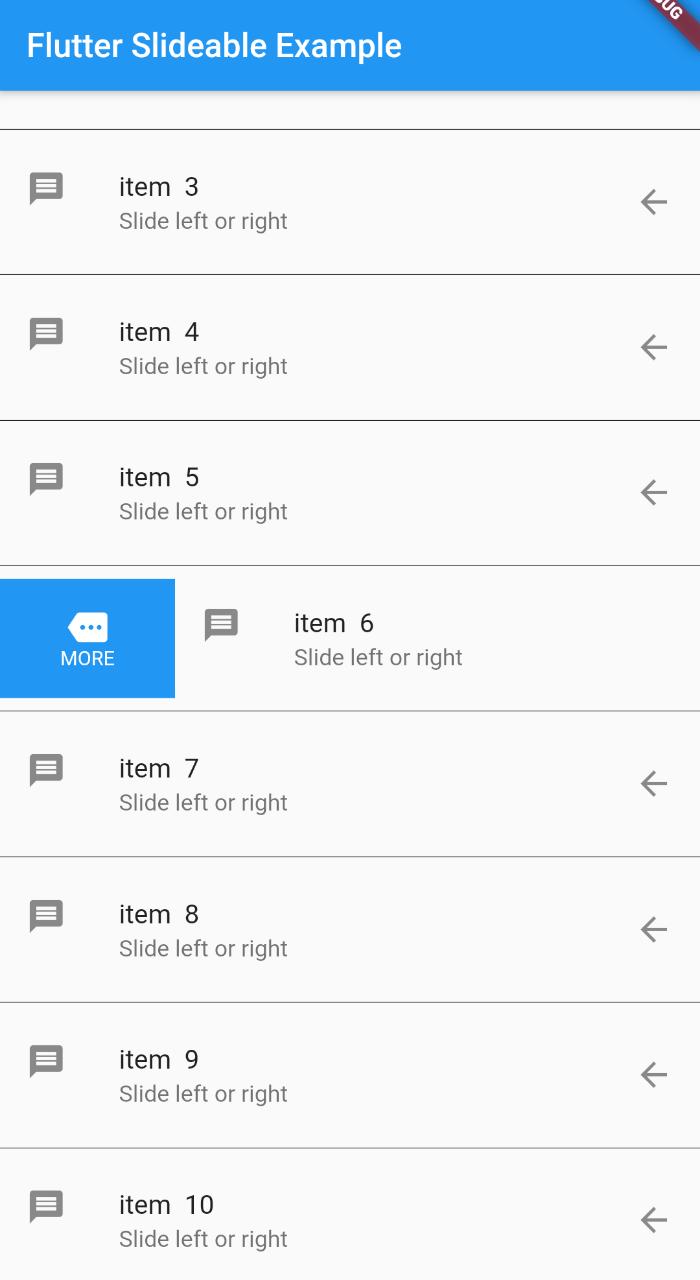
ListView Seperated ( with Divider )
How to add a seperator or divider in flutter ListView ?
separatorBuilder: (context, index) => Divider(
              color: Colors.black,
            ),
Complete Code with ListView Seperated

import 'package:flutter/material.dart';
import 'package:flutter_slidable/flutter_slidable.dart';

void main() => runApp(MyApp());

class MyApp extends StatelessWidget {
  // This widget is the root of your application.
  @override
  Widget build(BuildContext context) {
    return MaterialApp(
      title: 'Flutter Demo',
      theme: ThemeData(
        primarySwatch: Colors.blue,
      ),
      home: MyHomePage(),
    );
  }
}

class MyHomePage extends StatefulWidget {
  @override
  _MyHomePageState createState() => _MyHomePageState();
}

class _MyHomePageState extends State<MyHomePage> {
  @override
  Widget build(BuildContext context) {
    final List<String> items =
        new List<String>.generate(10, (i) => "item  ${i + 1}");
    return Scaffold(
      appBar: AppBar(
        title: Text("Flutter Slideable Example"),
      ),
      body: ListView.separated(
          separatorBuilder: (context, index) => Divider(
                color: Colors.black,
              ),
          itemCount: items.length,
          itemBuilder: (context, int index) {
            return Slidable(
              actions: <Widget>[
                IconSlideAction(
                  icon: Icons.more,
                  caption: 'MORE',
                  color: Colors.blue,
                  onTap: () {
                         print("More ${items[index]} is Clicked");
                  }
                ),
              ],
              secondaryActions: <Widget>[
                IconSlideAction(
                  icon: Icons.clear,
                  color: Colors.red,
                  caption: 'Cancel',
                  onTap: () {
                           print("Cancel ${items[index]} is Clicked");
                       }
                )
              ],
              child: ListTile(
                leading: Icon(Icons.message),
                title: Text("${items[index]}"),
                subtitle: Text("Slide left or right"),
                trailing: Icon(Icons.arrow_back),
              ),
              actionPane: SlidableDrawerActionPane(),
            );
          }),
    );
  }
}
Learn more about Flutter slidable widget on official site
Recommended Articles
listwheelscrollview – 3D ListView in flutter


[…] then, we also need Slidable so that using can easily slide the listTile to delete or remove any notes to […]