
")


Hi Guys, Welcome to Proto Coders Point, In this Flutter tutorial will learn a new way to add bottom navigation bar in flutter by using flutter new Material You Navigation Bar Widget.
Important Note: To use new Material you navigation bar widget you need to switch to flutter master channel.
How to change flutter channel to master
- Step 1: In your IDE Terminal run below command
” flutter channel master “ - Step 2: Then flutter update/upgrade Type
” flutter upgrade “ - Step 3: Restart your IDE
Thus, now you can use flutter material you navigation bar, Does it replace the aged flutter bottom navigation bar? let’s implement it and try it out now.
Let’s get started
Flutter material you Navigation bar widget
The first Material you widget i.e. “NavigationBar” is now been approved as new alternative way of adding bottom navigation bar into flutter app & its available to use in flutter master channel.
Therefore, flutter developers need to switch master channel to make use of material you in flutter.
Snippet Code
NavigationBar(
          height: 65,
          selectedIndex: 0,
          labelBehavior: NavigationDestinationLabelBehavior.onlyShowSelected,
          animationDuration: Duration(seconds: 2),
          onDestinationSelected: (index) {
            // callback to change between pages
          },
          destinations: const [
            // list of NavigationDestination Tabs
          ],
        ),
NavigationBar Properties
| Properties | Description | Example |
| destinations:[//list] | List of Navigation Destination. note: destination tab list must be two or more. | below |
| selectedIndex: | Active tab of Navigation bar. index starts from 0,1….n | selectedIndex : 2 |
| onDestinationSelected:(index) | Is a method is used to display pages of nav bar when user click on tab. | example in below complete code. |
| backgroundColor: | Change color of nav bar | backgroundColor: Colors.blue.shade200, |
| height: | specify height of nav bar | height: 60 |
| labelBehavior: | We can hide or show or show only selected tab label | NavigationDestinationLabelBehavior.onlyShowSelected NavigationDestinationLabelBehavior.alwaysHide NavigationDestinationLabelBehavior.alwaysShow |
| animationDuration: | animation effect during switching to another page or content | animationDuration: Duration(seconds: 2), |
NavigationDestination bottom Bar tab properties
Snippet Code
destinations: const [
            NavigationDestination(
              icon: Icon(Icons.access_time),
              label: 'Status',
              selectedIcon: Icon(Icons.access_time_filled),
            ),
            NavigationDestination(
              icon: Icon(Icons.call),
              label: 'Call',
              selectedIcon: Icon(Icons.call_outlined),
            ),

          ],
| Properties | Description | Example |
| icon | set an icon to Navigation bar tabs | icon: Icon(Icons.access_time) |
| selectedIcon | if nav tab is active will show this icon | selectedIcon: Icon(Icons.access_time_filled) |
| label | Text label to navigation bar tab | label: ‘Status’, |
How to change Naivgation Bar label/Text Size, Color
To change Material You Navigation Bar labelTextStyle, you need to wrap NavigationBar with NavigationBarTheme & use data property with NavigationBarThemeData & then use labelTextStyle.
Check out below snipper code for better understanding
bottomNavigationBar: NavigationBarTheme(
        data: NavigationBarThemeData(
            labelTextStyle: MaterialStateProperty.all(
                TextStyle(fontSize: 14, fontWeight: FontWeight.w400),
          ),
       ),
        child: NavigationBar(....)
 ),
Complete Source Code – Flutter Master Material You Navigation Bar
I am going to show 5 navigation tab.
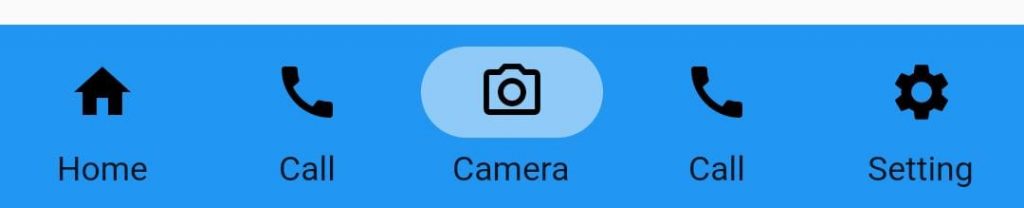
so let’s create 5 pages
- HomePage()
- CallPage()
- CameraPage()
- ChatPage()
- SettingPage()
HomePage.dart
import 'package:flutter/material.dart';

class HomePage extends StatelessWidget {
  const HomePage({Key? key}) : super(key: key);

  @override
  Widget build(BuildContext context) {
    return Scaffold(
      body: Center(
        child: Container(
          height: 200,
          width: 200,
          child: Icon(Icons.home,size: 50,),
        ),
      ),
    );
  }
}
CallPage.dartt
import 'package:flutter/material.dart';

class CallPage extends StatelessWidget {
  const CallPage({Key? key}) : super(key: key);

  @override
  Widget build(BuildContext context) {
    return Scaffold(
      body: Center(
        child: Container(
          height: 200,
          width: 200,
          child: Icon(Icons.call,size: 50,),
        ),
      ),
    );
  }
}
Likewise create 3 more dart file as defined above and just change Icons
main code main.dart
import 'package:flutter/material.dart';
import 'package:navigationbar/call.dart';
import 'package:navigationbar/camera.dart';
import 'package:navigationbar/chat.dart';
import 'package:navigationbar/home.dart';
import 'package:navigationbar/setting.dart';

void main() {
  runApp(const MyApp());
}

class MyApp extends StatelessWidget {
  const MyApp({Key? key}) : super(key: key);

  // This widget is the root of your application.
  @override
  Widget build(BuildContext context) {
    return MaterialApp(
      debugShowCheckedModeBanner: false,
      title: 'Flutter Demo',
      theme: ThemeData(
        primarySwatch: Colors.blue,
      ),
      home: const MyHomePage(),
    );
  }
}

class MyHomePage extends StatefulWidget {
  const MyHomePage({Key? key}) : super(key: key);

  @override
  _MyHomePageState createState() => _MyHomePageState();
}

class _MyHomePageState extends State<MyHomePage> {
  int tabselected = 0;
  final pages = [
    HomePage(),
    CallPage(),
    CameraPage(),
    ChatPage(),
    SettingPage(),
  ];

  @override
  Widget build(BuildContext context) {
    return Scaffold(
      body: Container(
        child: pages[tabselected],
      ),
      bottomNavigationBar: NavigationBarTheme(
        data: NavigationBarThemeData(
          indicatorColor: Colors.blue.shade200,
          backgroundColor: Colors.blue.shade500,
          labelTextStyle: MaterialStateProperty.all(
            TextStyle(fontSize: 14, fontWeight: FontWeight.w400),
          ),
        ),
        child: NavigationBar(
          height: 65,
          selectedIndex: tabselected,
          labelBehavior: NavigationDestinationLabelBehavior.alwaysShow,
          animationDuration: Duration(seconds: 2),
          onDestinationSelected: (index) {
            setState(() {
              tabselected = index;
            });
          },
          destinations: const [
            NavigationDestination(
              icon: Icon(Icons.home),
              label: 'Home',
              selectedIcon: Icon(Icons.home_outlined),
            ),
            NavigationDestination(
              icon: Icon(Icons.call),
              label: 'Call',
              selectedIcon: Icon(Icons.call_outlined),
            ),
            NavigationDestination(
              icon: Icon(Icons.camera_alt),
              label: 'Camera',
              selectedIcon: Icon(Icons.camera_alt_outlined),
            ),
            NavigationDestination(
              icon: Icon(Icons.call),
              label: 'Call',
              selectedIcon: Icon(Icons.call_outlined),
            ),
            NavigationDestination(
              icon: Icon(Icons.settings),
              label: 'Setting',
              selectedIcon: Icon(Icons.settings_applications),
            ),
          ],
        ),
      ),
    );
  }
}
Related Article
Bottom Navigation Bar with Fancy Animation effect
Salomon Navigation Bar in flutter


